Kajabi Checkout Page Optimization Guide for Coaches

Kajabi checkout page optimization is the process of customizing and refining your checkout experience using Kajabi's Enhanced Checkout and proven conversion tactics to drive higher purchase completion rates.
With Kajabi's 2026 purchase flow upgrades, this is now more important than ever to maximize conversions. Your checkout page is the last thing standing between a motivated buyer and a completed sale. Get it wrong and you lose revenue you already earned through your sales page, your content, and your marketing.
This guide covers the full picture: platform settings, trust signals, upsell strategy, abandoned cart recovery, and iterative testing so your checkout works like a well-oiled machine from day one.
What does Kajabi's Enhanced Checkout offer for customization?
Enhanced Checkout is Kajabi's fully customizable, mobile-friendly checkout system that requires zero custom code to configure. That matters because most coaches and course creators are not developers. You should be spending your time on your clients, not wrestling with CSS.
Here is what Enhanced Checkout gives you out of the box:
- Customizable sections and content blocks that let you add testimonials, guarantee badges, and product details directly on the checkout page
- Checkout templates you can select from Kajabi's library or upload your own custom template
- Centralized settings via the Offer Settings and Purchase Flow tabs, which control behavior across all checkout types for a given offer
- Sync vs. override controls that let you apply global button styles and text or override them at the individual checkout level
- Checkout blocks you can embed directly into landing pages and website pages for a fully integrated experience
The centralized management system is one of the most underused features in Kajabi. Most users set up their checkout once and never revisit it. But Offer Settings and Purchase Flow tabs control everything from field visibility to order bump placement, giving you precise control without touching each page individually.
| Setting | What it controls |
|---|---|
| Offer Settings | Fields, pricing options, service agreements, order bumps |
| Purchase Flow | Post-purchase redirects, upsell sequences, confirmation behavior |
| Sync mode | Applies global button style and text to all checkouts for that offer |
| Override mode | Lets you customize individual checkout pages for testing or segmentation |
Pro Tip: Turn off sync on one checkout page and test a different button label or color. This gives you a controlled experiment without disrupting your other offers.
How can you reduce friction and build trust to increase conversions?
Checkout friction is the top cause of cart abandonment, and simplifying forms plus adding trust signals directly reduces drop-off. The goal is to make completing the purchase feel effortless and safe.

Start by auditing your checkout form fields. Every field you ask buyers to fill out is a micro-decision that costs momentum. Remove anything that is not required to complete the transaction. First name, email, and payment details are usually enough. Asking for a phone number or mailing address when you are selling a digital course creates unnecessary hesitation.
Trust signals belong near your call-to-action button, not buried at the bottom of the page. Place these elements strategically:
- A secure payment badge (Stripe or PayPal logos work well here)
- A money-back guarantee statement with a specific timeframe, such as "30-day no-questions-asked refund"
- One or two short testimonials from past clients, ideally with a photo and specific result
- A brief product summary that reminds buyers exactly what they are getting
Mobile optimization is non-negotiable. More than half of online purchases happen on a phone, so your checkout must load fast, use large tap targets for buttons, and display readable text without zooming. Kajabi's Enhanced Checkout is mobile-responsive by default, but you still need to preview your page on a phone before publishing. A button that looks perfect on desktop can be cut off or hard to tap on a smaller screen.
Pro Tip: Add a one-sentence guarantee on your checkout page. Something like "Your purchase is protected by our 30-day money-back guarantee" at that exact moment of decision reduces buyer anxiety more than any other single element.
What tactics increase average order value through upsells and order bumps?
Post-purchase upsells in Kajabi can boost average order value by 15 to 40%, with well-designed upsell pages achieving take rates of 10 to 25%. That is significant revenue added without acquiring a single new customer. The key is relevance and simplicity.
Here is how to set up and design upsells that actually convert:
- Configure your upsell in Offer Settings under the Purchase Flow tab. You can set a redirect path for both acceptance and decline so buyers never land on a dead end.
- Focus each upsell page on a single offer. One product, one price, one decision. Adding multiple options at this stage kills conversions.
- Show clear pricing with a visible discount if applicable. Buyers who just spent money are primed to spend more, but only if the value is obvious.
- Make declining easy. A visible "No thanks" link reduces buyer resentment and keeps your refund rate low.
- Match the upsell to the core purchase. If someone buys your beginner course, offer the advanced module or a 1:1 coaching session, not an unrelated product.
Order bumps work differently from upsells. They appear on the checkout page itself, before the buyer clicks purchase, as a checkbox add-on. A well-placed order bump offering a workbook, template pack, or bonus session for a small additional fee can add 10 to 20% to your transaction value with almost no extra friction.
| Upsell type | Placement | Best for |
|---|---|---|
| Order bump | Checkout page (pre-purchase) | Low-cost add-ons, templates, bonuses |
| Post-purchase upsell | Confirmation redirect page | Higher-ticket offers, coaching upgrades |
Pro Tip: Track your upsell take rate, AOV lift, and refund rate as a trio. A high take rate with a high refund rate signals your upsell is misleading or mismatched. Adjust the offer before scaling.
How do abandoned checkout emails recover lost sales in Kajabi?
Kajabi's abandoned checkout emails now reach any user who enters an email address and begins checkout, not just existing customers. This is a significant expansion. Previously, only people already in your Kajabi database received recovery emails. Now, a first-time visitor who gets halfway through checkout and leaves can still receive a follow-up sequence.
This matters because most people who abandon checkout are not gone forever. They got distracted, had a question, or hesitated at the price. A well-timed email sequence brings them back.
Best practices for abandoned checkout email sequences:
- Email 1 (within 1 hour): Simple reminder with a direct link back to checkout. No pressure, just a helpful nudge.
- Email 2 (within 24 hours): Address the most common objection. Reinforce your guarantee, share a testimonial, or clarify what is included.
- Email 3 (within 48 to 72 hours): Create urgency if appropriate. A limited-time bonus or enrollment deadline works here if it is genuine.
Checkout label overrides in Kajabi let you customize button text and field labels to match your brand voice. Changing "Submit" to "Yes, I'm in!" or "Complete Purchase" to "Get Instant Access" is a small update that aligns the checkout language with the energy of your sales page.
Linguistic alignment of checkout labels to brand voice preserves buyer momentum, preventing confusion or hesitation at the final step.
A buyer who has been reading your sales page in your voice should not hit a checkout page that feels like it belongs to a different brand. Consistency at this stage is what closes the sale.
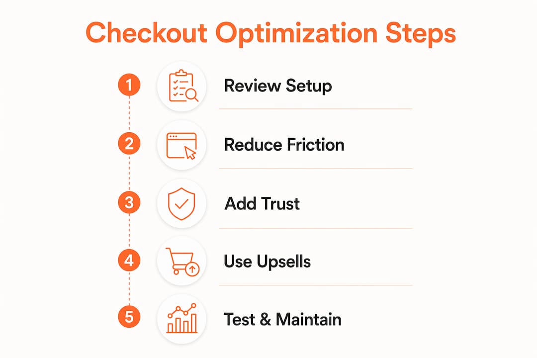
What are the best methods to test and maintain your checkout over time?
Iterative testing with Kajabi's built-in tools yields better gains than one-off redesigns. The coaches who see the biggest conversion improvements are the ones who treat their checkout as a system to refine, not a task to complete once.
Here is a practical testing process:
- Start with your highest-abandonment product. Per-product abandonment reports show you exactly where cart losses are highest. Fix those first.
- Use override mode to test one variable at a time. Change only the button text, or only the order bump copy, not both simultaneously. This keeps your data clean.
- Track three core metrics: conversion rate (purchases divided by checkout page visits), upsell take rate, and bounce rate on the checkout page itself.
- Align your checkout page visually with your sales page. Use the same fonts, colors, and tone. A buyer who clicks "Enroll Now" on your sales page should feel like they are still in the same experience.
- Revisit your checkout every 90 days. Offers change, prices change, and what worked six months ago may not reflect your current brand or audience.
Common pitfalls that cause sudden drops in checkout conversions include broken payment integrations, expired coupon codes left active, and upsell redirect paths pointing to deleted pages. Run a full checkout test after any major Kajabi update or offer change.
Pro Tip: Do a full buyer-journey walkthrough on your phone every quarter. Start from your sales page, click through to checkout, and complete a test purchase. You will catch issues that analytics alone will never show you.
Key takeaways
Kajabi checkout optimization requires treating your checkout as a living system, not a one-time setup, with continuous testing, trust-building, and upsell refinement driving the highest sustained conversion gains.
| Point | Details |
|---|---|
| Use Enhanced Checkout fully | Leverage sections, blocks, templates, and sync controls to build a branded, mobile-ready experience. |
| Remove form friction | Cut unnecessary fields and place trust signals directly above your payment button. |
| Add upsells and order bumps | Target 10 to 25% take rates with single-offer upsell pages and relevant pre-purchase add-ons. |
| Activate abandoned checkout emails | Reach new visitors who start checkout and leave, not just existing customers. |
| Test iteratively by product | Use per-product abandonment data to prioritize fixes and override settings for controlled experiments. |
What I've learned from watching coaches leave money at checkout
Here is something I see constantly: coaches spend weeks perfecting their sales page and then spend about 20 minutes on their checkout. That imbalance is where revenue disappears.
The checkout page is not just a transaction form. It is the moment your buyer either confirms their decision or second-guesses it. Every element on that page either builds confidence or creates doubt. A generic button label, a mismatched font, or a missing guarantee statement can undo everything your sales page worked to build.
What I have found actually works is treating checkout configuration like a client flow system. You map it out, you test each stage, and you check the data. The Kajabi features built for coaches give you everything you need to do this without custom development. The platform is capable. The gap is almost always in how it is configured.
Small language changes have outsized impact. Swapping "Buy Now" for "Start Your Transformation" on a coaching program checkout is not fluff. It is alignment. It keeps the buyer in the emotional state your sales page created. That continuity is what closes sales.
Use upsells thoughtfully. An upsell that feels like a cash grab will generate refunds and resentment. An upsell that genuinely extends the value of the core purchase builds trust and increases lifetime customer value. The difference is relevance, and relevance comes from knowing your buyer.
Ready to build a checkout that converts?
If your Kajabi checkout is not performing the way you know it should, the fix is usually in the details: the layout, the copy, the trust signals, and the post-purchase flow.
At Sierra Lin Design, I work with coaches and course creators to build Kajabi sites that are designed to convert, not just look good. You can grab free Kajabi templates to start implementing high-converting designs right now, no tech headaches required. If you want a fully custom solution built around your brand and your offers, explore custom Kajabi design services to see how we can build your checkout experience from the ground up.
FAQ
What is Kajabi Enhanced Checkout?
Kajabi Enhanced Checkout is a fully customizable, mobile-friendly checkout system that lets you add content blocks, testimonials, and branded templates without writing any code. It centralizes settings across all your offers through the Offer Settings and Purchase Flow tabs.
How do I reduce cart abandonment on my Kajabi checkout page?
Remove unnecessary form fields, add trust signals like a money-back guarantee and secure payment badges near your CTA button, and activate Kajabi's abandoned checkout email sequence to recover visitors who leave before completing their purchase.
What is a good upsell take rate in Kajabi?
A well-designed Kajabi upsell page targeting a relevant offer achieves a take rate of 10 to 25%, with average order value increases of 15 to 40%. Single-offer upsell pages with clear pricing and an easy decline option perform best.
Can I test different checkout button text in Kajabi?
Yes. By disabling sync on an individual checkout page, you can override the default button text and style to test variations without affecting your other offers. This is Kajabi's built-in method for running controlled checkout experiments.
How often should I review my Kajabi checkout page?
Review your checkout every 90 days and after any major offer change or Kajabi platform update. Use per-product abandonment reports to identify which offers need attention first, and run a full test purchase on mobile to catch issues analytics may miss.
Recommended
🚨Get the FREE Checklist
Skip the Kajabi tears—Swipe the free Website Checklist & Funnel Map
Exactly what should go where on your Kajabi site to maximize leads.