9 Common Kajabi Website Mistakes and How to Fix Them

Used correctly and strategically, Kajabi is a fabulous all-in-one tool that can save you time while simultaneously up-leveling your online presence to help you become known as the go-to in your industry.
But use it incorrectly... and the platform can be a major money sink! 😫
Great news though - I’ve compiled the most common mistakes I see business owners making on their Kajabi websites, and it’s all in this juicy blog post.
The other good news? These mistakes are all simple to fix, and I’m going to tell you how. 🙌
You already know the power of using your business's tech platforms to their fullest potential (time and $$$$ saved!), so let’s make sure you're making the most of your Kajabi platform.
Mistake #1: Forgetting to showcase your lead magnet freebie
You've worked hard to create a standout lead magnet (or opt-in "freebie") that speaks to your ideal client and entices them to sign-up for your email list. The last thing we want to do is make it hard for them to find that high-value lead magnet!
Don't forget to display your lead magnet freebie "opt-in" section at the bottom of all of the main pages of your website (like your Homepage, About Page, etc.) This can be done by adding a new section in the Kajabi page customization window and adding your freebie sign-up form.
I also recommend creating a standalone page devoted to showcasing your lead magnet, or an “Opt-In Landing Page” that you can direct traffic to from your Instagram link in bio (or your chosen platform of authority).
Mistake #2: Having a "thank you message" appear after purchase or opt-in
This is a common mistake I see on so many websites. Often, an opt-in will just redirect to a page that says “Thank you” or something similar, with no alternate CTA. This is a missed opportunity to give your new subscriber (or buyer) a further call to action (CTA) to deepen the relationship between your ideal client and your brand.
Kajabi allows you to redirect any form submission or checkout page to a Landing Page of your choice, so design a Thank You Page to showcase a new CTA for every lead magnet form or offer checkout.
Some effective ideas for a Thank You Page CTA include an invitation to join your Facebook group, an invitation to read your most popular blog post(s), an invitation to listen to your podcast, or to book a free Discovery Call.
Mistake #3: Forgetting "upsell" landing pages
This is a great tip to increase conversions and put more money in your bank.💰
Turns out, you do not need an additional platform or subscription to showcase custom upsells to your buyers.
What’s an upsell you ask?
An upsell is an offer you pitch following the purchase of a lower ticket offer; for example: after your client purchases your course, you invite her to a limited special on your high-ticket program. 🥳
To add a customized upsell to your low-ticket offer checkout: First, create a Landing Page showing off your high-ticket offer with a special discount (perhaps a percentage off) and make sure to hide this page from search engine results.
Then in your low-ticket offer checkout, designate your new Landing Page with the special offer as the "custom thank you page."
That’s it!
Mistake #4: Hiding testimonials and reviews on one page
Nothing speaks to potential clients quite like social proof (that's your testimonials, reviews, and screenshot social media praise).
Displaying your social proof on every page of your website is essential because it helps to establish credibility and builds viewer trust in you and your brand.
This means it's time to ditch the "Testimonials" or "Client Love" pages altogether. Instead, sprinkle your social proof all over your website like confetti. 🎉
And, much like confetti, the more the merrier when it comes to social proof. Don't be afraid to experiment with video testimonials as well!

Mistake #5: Copy that fails to speak to your ideal client’s pain and pleasure points
The ultimate goal is to have your ideal client scroll through your homepage thinking:
“Oh my gosh . . . she really gets it! How does she know exactly what I need to hear? How can I learn more from her?”
Strategic websites with magnetizing messaging achieve this by displaying website copy (or the words on your website) that focuses on both an ideal client’s pleasure and pain points.
For the pain points, consider your ideal client’s deepest problems and what they are currently struggling with.
Consider how your ideal client would complete the sentence: “I would pay anything not to have / to get rid of _____.” Now position your services as solutions to that exact problem or pain.
For the pleasure points, consider your ideal client’s deepest desires.
Consider how your ideal client would complete the sentence: “I would pay anything for _______.” Now position your services and offerings as providing that exact thing.
Learn more about how to craft a winning marketing strategy that magnetizes your ideal people in this blog post.
Mistake #6 - Using oversized images
Uploading oversized images to your website can contribute to a slow-loading platform. And the slower your website loads, the more likely your ideal client is to bounce before checking out your offers.
Think about it like that scene from Zootopia with the sloth who works at the DMV. Or think about any time you’ve waited at the DMV. 😂
The frustration you feel from the mind numbing slowness of that place is akin to how visitors feel waiting for your page to load. And they won’t stick around for it.
Instead of uploading original sized stock or brand photos to your website, make sure to resize the images to the perfect dimensions first. Kajabi recommends a background image width no larger than 2880 pixels (though you can safely get away with an even smaller image width as well!). For extra brownie points (and an even faster site) optimize your properly resized images using a free online compression tool like ShortPixel before uploading to your website.
Mistake #7: Having only one automated email in your lead magnet freebie delivery sequence
Whether you're using Kajabi as your primary email list-building platform (or another email list-building platform), you don't want to miss the opportunity to nurture your new subscribers with an automated email "welcome sequence."
The purpose of this automated sequence is to first deliver your amazing lead magnet, and then to build a connection with your ideal client by telling the story of your business and your brand. If you do this in only one email, many of your subscribers won’t even see it.
It often takes several “touches” (an email, call, social post, dm) for an ideal client to respond to your offer, let alone open your dang email. 📧
Including several emails in your initial drip sequence gives you a better chance to connect with your ideal people.
Mistake #8: Using subscriber tags only occasionally
Consider "tags" your easy-to-use Kajabi superpower.
Tagging your ICs (both leads and current clients!) allows you to streamline your marketing to the individual needs of each and every ideal client.
This way, you can avoid sending sales emails to clients who've already purchased and only send marketing emails to specific subscribers based on the offers they currently own, or have shown interest in.
Mistake #9: Using one sales page to showcase all of your offers
Each and every one of your offers (from your low-ticket ebook to that high-ticket one-on-one package) deserves to be showcased as the high-value solution that it is. That means you need a Sales Page for each and every one of your offers to help your ideal client see the value that they provide.
You may have a Services or Work With Me style page highlighting all the offers you provide, but make sure to also create a distinct Sales Page for every offer that you sell.
Doing so allows you to highlight the particular benefits of each distinct program, making your ideal people excited and ready to buy or apply! 🙌
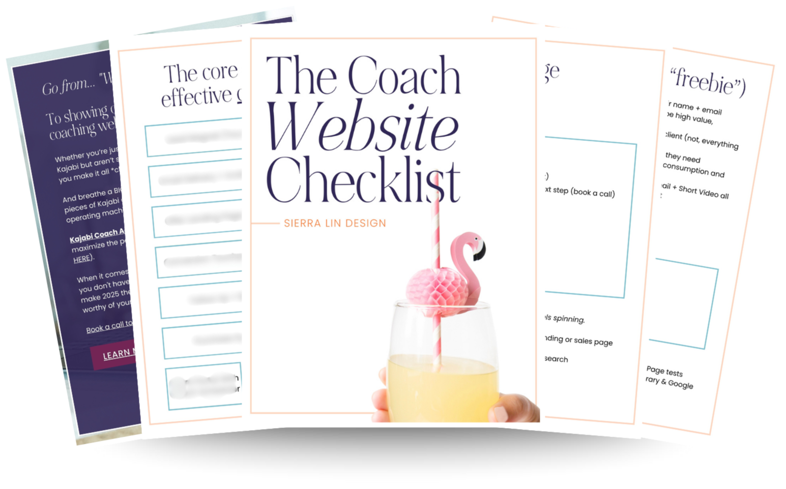
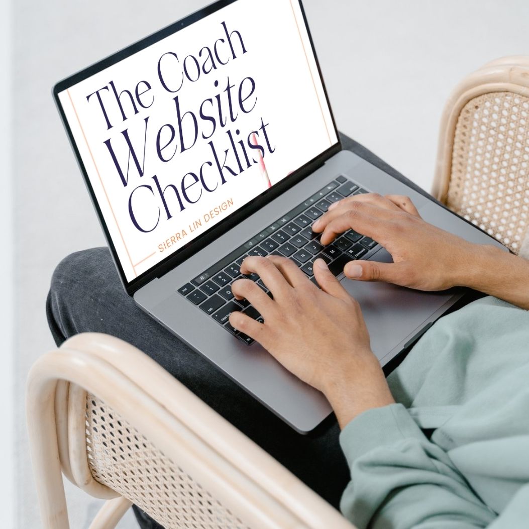
🚨Get the FREE Checklist
Skip the Kajabi tears—Swipe the free Coach Website Checklist & Funnel Map
Exactly what should go where on your Kajabi site to maximize coaching leads.