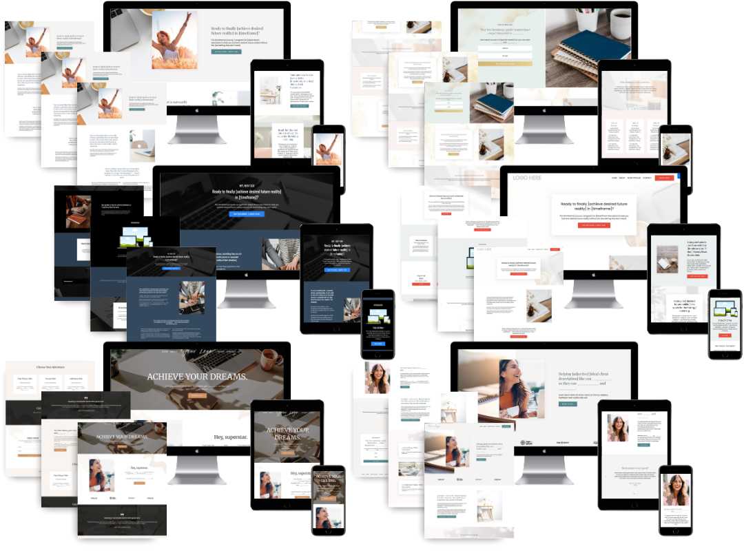
Kajabi Consulting Offer Page Examples That Convert

A Kajabi consulting offer page is a dedicated sales page that combines a detailed service description with an integrated checkout experience to turn visitors into paying clients. The best kajabi consulting offer page examples do not separate the pitch from the purchase. They treat the landing page and checkout as one unified flow, with consistent visuals, clear pricing, and trust signals placed exactly where hesitation tends to appear. Kajabi's Enhanced Checkout makes this possible by supporting multiple pricing options, upsell funnels, and abandoned checkout recovery inside a single offer structure. If your current page feels disconnected or your checkout looks nothing like your brand, these examples will show you what a high-converting setup actually looks like.
1. Long-form sales landing page with Enhanced Checkout integration
The long-form consulting sales page is the most common and highest-converting format for premium offers. It gives you room to explain the full transformation, address objections, and build trust before the visitor ever sees a price. The key is structure: every section earns its place by moving the reader closer to a decision.
A well-built long-form page for a consulting offer typically includes:
- A headline that names the specific result the client will get
- A short video or professional photo above the fold
- A detailed breakdown of what is included in the consulting package
- Three to five client testimonials placed near the pricing section
- A clear CTA button that appears at least twice on the page
- An FAQ section addressing the most common objections
The Enhanced Checkout integration supports unlimited pricing options, including one-time payments, payment plans, and subscriptions, all managed under a single offer. That means you can show a "pay in full" option alongside a three-month payment plan without building separate pages for each.
Pro Tip: Keep your checkout page colors, fonts, and tone identical to your landing page. A jarring visual shift at checkout is one of the fastest ways to lose a buyer who was ready to say yes.

Visual consistency between the landing page and checkout is not a design preference. It is a conversion strategy. Designing both pages as one unified flow prevents abandonment caused by confusion or unexpected price jumps.
2. Focused offer page for live workshop consulting packages
Workshop consulting packages need a different page structure than ongoing retainer offers. The urgency is built in because the event has a date. Your page should reflect that without feeling pushy.
The most effective workshop offer pages keep the registration flow short and direct:
- A clear headline naming the workshop topic and the date
- A concise description of what participants will learn and walk away with
- A single purchase option that grants immediate access
- A thank-you page with the Zoom link, calendar invite, and next steps
- An automated email confirmation that fires within minutes of purchase
Optimizing the post-purchase thank-you page with access details, scheduling links, and next steps maintains buyer momentum and reduces confusion after the sale. This is especially important for live events where a confused buyer may request a refund simply because they cannot find the link.
The backend structure matters too. Build the workshop as a Kajabi product so you can add recordings, bonus resources, or follow-up content later without rebuilding the offer. Automated email sequences handle client onboarding so you are not manually sending welcome messages the night before the event.
3. Multi-service consulting website with dedicated offer pages
Larger consulting businesses often need more than one offer page. A leadership consultant might sell a VIP day, a group program, and a monthly retainer. Each service deserves its own page, but the site as a whole needs to feel cohesive.
The best multi-service Kajabi setups share these design traits:
- Consistent spacing, font choices, and color palette across all pages
- A clear navigation structure that guides visitors to the right offer
- Individual offer pages that each stand alone without requiring the visitor to read the whole site first
- Responsive layouts that look clean on mobile without extra adjustments
Kajabi's scalability makes this type of setup practical for growing consulting firms. You can add new offer pages, update pricing, and manage access for multiple products from one dashboard. That reduces the technical overhead that typically slows down growing businesses.
The key design principle for multi-service pages is restraint. Each page should highlight one offer clearly. Listing every service on every page dilutes attention and reduces conversions.
4. How Kajabi's Enhanced Checkout improves consulting offer pages
Kajabi's Enhanced Checkout is the feature that separates a basic offer page from a high-converting one. It handles the mechanics of pricing, upsells, and recovery so you can focus on the messaging.
Here is what Enhanced Checkout adds to a consulting offer page:
- Multiple pricing options. You can offer a one-time payment, a three-month plan, and an annual subscription on the same checkout page. Buyers choose what works for them without leaving the page.
- Recommended pricing highlights. Highlighting a preferred pricing tier uses behavioral psychology to nudge buyers toward the option that generates more revenue per sale.
- Upsell and downsell funnels. After a buyer completes checkout, you can present a related offer. This increases average order value without requiring more traffic.
- Checkout label overrides. You can rename fields and buttons to match your brand voice, which keeps the experience feeling personal rather than generic.
- Abandoned checkout recovery. Kajabi's 2026 checkout updates capture email addresses from all visitors who enter the checkout, even if they do not complete the purchase. This means you can follow up with a recovery sequence automatically.
Pro Tip: Add order bumps and upsell configurations inside the offer checkout settings, not as separate pages. Keeping everything inside one offer structure makes access management and reporting far cleaner.
Properly implementing upsell and downsell funnels at the checkout stage, alongside trust signals like testimonials and guarantees, significantly increases revenue per visitor.
5. Key design and messaging strategies from successful consulting offer pages
The design choices on your offer page either build confidence or create doubt. The best consulting pages do not leave that to chance.
Strong consulting offer pages consistently apply these practices:
- Benefit-driven headlines. Lead with the result the client gets, not the name of the program.
- Testimonials near the price. Place social proof directly above or below the pricing section where hesitation peaks.
- Professional photography. A high-quality headshot or brand photo signals credibility before the visitor reads a single word.
- Minimal navigation. Remove the main site menu from your offer page. Every link that takes a visitor away from the page is a lost sale.
- Clear post-purchase path. Tell buyers exactly what happens after they pay. "You will receive an email within five minutes with your login details" removes the anxiety that causes last-minute cart abandonment.
Reducing form fields and adding trust signals on checkout pages significantly increases conversion rates. Fewer fields mean less friction. More trust signals mean less doubt.
Review your checkout on both desktop and mobile. Make the offer details, payment terms, and next steps easy to read, and check that every field and button works comfortably on a phone.
For messaging, the most effective consulting pages use a simple structure: name the problem, describe the transformation, explain the process, show proof, and present the offer. That sequence works because it mirrors how buyers actually make decisions. You can learn more about writing this kind of copy in this guide on writing a high-converting sales page.
Kajabi Pipelines that combine landing pages, checkout, and email sequences outperform isolated tools by creating a connected client flow from interest to purchase. The pipeline approach also minimizes the technical overhead that trips up most solo consultants.
Key takeaways
The most effective Kajabi consulting offer pages treat the landing page and checkout as one unified experience, not two separate tasks.
| Point | Details |
|---|---|
| Unified page and checkout flow | Design landing and checkout pages with matching visuals to prevent abandonment at the price reveal. |
| Enhanced Checkout pricing options | Use one-time, payment plan, and subscription tiers on one page to serve buyers at different commitment levels. |
| Trust signals near the price | Place testimonials and guarantees directly above or below the pricing section where hesitation is highest. |
| Post-purchase thank-you page | Include login details, next steps, and scheduling links immediately after purchase to maintain client momentum. |
| Minimal navigation on offer pages | Remove site menus from consulting offer pages to keep visitors focused on one decision. |
What I've learned from building Kajabi consulting pages that actually sell
Most coaches and consultants spend weeks perfecting their offer page copy and then lose buyers at checkout because the checkout page looks like it belongs to a different website. That disconnect is the single most common conversion killer I see. The buyer was ready. The checkout page made them second-guess everything.
The fix is not a redesign. It is alignment. Your checkout page needs to feel like the natural next step after your landing page, not a jarring handoff to a generic form. That means matching colors, fonts, and even the tone of your button labels. When I build pages through Sierra Lin Design, this is one of the first things I lock in before anything else.
The other thing most people underuse is the recommended pricing highlight inside Enhanced Checkout. Marking one option as recommended is not manipulative. It is helpful. Buyers want guidance. When you highlight the annual plan or the pay-in-full option, you are doing the buyer a favor by reducing decision fatigue. And yes, it increases revenue without requiring a single extra lead.
Mobile optimization is non-negotiable in 2026. If your offer page is not tested on a phone before it goes live, you are leaving money on the table. Most of your buyers will see your page on a phone first. Build for that reality.
The consulting pages that convert well are not the most beautiful ones. They are the most clear ones. Clear headline. Clear price. Clear next step. Everything else is decoration.
Ready to build a Kajabi offer page that works for your consulting business?
If you have been piecing together your offer page and it still does not feel quite right, you are not alone. Building a page that converts takes more than a good template. It takes a clear structure, the right Kajabi settings, and a design that makes your brand look credible from the first scroll. Sierra Lin Design builds custom Kajabi websites who are ready to stop settling for pages that sit quietly in a corner. You can also grab the free Kajabi templates to get a head start with layouts already built for consulting offers.
FAQ
What is a Kajabi offer page?
A Kajabi offer page is a sales page linked to a specific product or service that includes pricing options, checkout settings, and access management. It is where visitors become paying clients.
What is a Kajabi checkout page?
A Kajabi checkout page is the final step in the purchase flow where buyers enter payment details and complete their transaction. Enhanced Checkout allows you to customize this page with your branding, multiple pricing tiers, and upsell options.
How many pricing options can I add to a Kajabi consulting offer?
Kajabi's Enhanced Checkout supports unlimited pricing options under a single offer, including one-time payments, payment plans, and subscriptions.
Should my consulting offer page and checkout page match visually?
Yes. Consistent visuals between your landing page and checkout page reduce abandonment by preventing the confusion or doubt that comes from a sudden change in design.
What should go on a post-purchase thank-you page for a consulting offer?
Include login details, a scheduling link, and clear next steps. Delivering this information immediately after purchase maintains client momentum and reduces cancellation requests.
Recommended
 Sierra Janisse · Founder of Sierra Lin Design
Sierra Janisse is a verified Kajabi Expert who helps online business owners build profitable websites on Kajabi. From SEO and copywriting to website design, branding, automations and funnel strategy, she is the go-to expert for Kajabi users who want to attract more clients and customers with their websites.
🚨Get the FREE Checklist
Skip the Kajabi tears—Swipe the free Website Checklist & Funnel Map
Exactly what should go where on your Kajabi site to maximize leads.