Ready to Dance: Milan Pole Dance Studio’s Kajabi Website Transformation
Some projects make you want to close your laptop and sign up for a class. This was absolutely one of them.
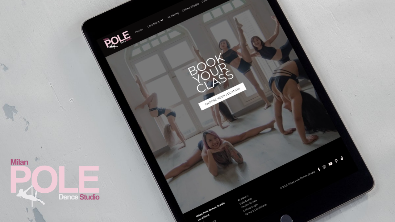
When we teamed up with Isabelle at Milan Pole Dance Studio, our goal was to bring the energy and excellence of her brand into its online home. We redesigned the homepage and location pages for this international brand, creating a more cohesive experience for visitors exploring the Milan Pole Dance offerings.
As a Kajabi website designer, I love helping businesses show the full value of what they offer. For this project, that meant giving an international pole and aerial arts brand a website with personality, purpose, and room to move.
A Global Community With Plenty to Explore
Milan Pole Dance Studio brings together a community around pole, aerial arts, dance, and flexibility. Its website connects visitors with studio locations and an online studio, so there are several ways to begin.
That variety made navigation a central consideration. Someone looking for a local class needs a different path from someone exploring online training. The website needed to welcome both and help each person find their next step.
Our project direction focused on improving the page experience and navigation while bringing the website into closer alignment with the brand. Beautiful design had a very practical job to do here!
A Homepage That Gets Visitors Moving
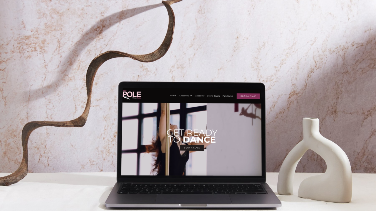
The refreshed homepage opens with “GET READY TO DANCE” and a direct invitation to book a class. Visitors can explore locations or discover the online studio from the same starting point.
We love how this structure gives the brand’s different experiences space to shine. The homepage introduces the wider community while keeping useful next steps within reach.
That’s an important part of my work as a Kajabi web designer: thinking through what someone needs to understand before they click. A compelling introduction creates interest; clear direction helps visitors act on it.
A Closer Look at Her Custom Location Pages
The Luxembourg page is a great example of using a location based landing page to improve SEO, and bring the experience down to a local level. Visitors can explore class types, review pricing, find booking guidance, and read answers to common questions.
For a newcomer, those details matter. Knowing where to start or how to sign up can make trying something unfamiliar feel more approachable. For returning students, a clear page makes practical information easier to find. We helped Isabelle create custom pages for other locations like Bari, Milan, and more!
This is where thoughtful Kajabi custom design earns its place. Each page should reflect the brand while serving the people who use it. A location page has its own questions to answer, and its structure should support that purpose.
The Client’s Reaction? EVERYTHING!
We can talk about the strategy all day, but hearing how the finished experience feels to the client is our favorite part.
When asked what they loved most about the new design and setup, Isabelle shared:
“EVERYTHING! How do you choose when every page, every detail, and every button meets all our needs... and then some? It all came together even better than we imagined!”
That response captures what we hope for with every project: a website the client feels excited to share because it reflects their business so well.
Asked how the update would impact the business, Isabelle said:
“This transformation truly positions our brand as a leader in the pole and aerial arts. The strong visuals, seamless user experience, quality, and sleek design now reflect the level of excellence we bring to everything we do.”
For us, that alignment is a meaningful outcome. Isabelle sees her brand’s standards reflected in the website, from the overall impression to the details.
A Redesign Process That Felt Approachable
A website redesign involves plenty of decisions. We want clients to feel supported as those decisions come together, with clear communication throughout the process.
Here’s what Isabelle shared about working with Sierra:
“Communication was always clear and easy, and Sierra made what could have been an overwhelming redesign process feel incredibly accessible and easy to navigate. She was extremely accommodating, responsive, and supportive every step of the way.”
We’re doing a little happy dance over that one. Helping clients feel comfortable with the process matters right alongside the finished design.
Ready for a Website That Reflects Your Business?
Whether we’re designing for an international studio or creating professional coaching websites, we start with the same question: what does your audience need to understand, feel, and do when they land on your site?
Your answer should shape the design. Your personality should shine through it. And you should feel excited to send people there.
Take a look at Milan Pole Dance Studio’s website to explore the refresh, then connect with Sierra Lin Design to talk about your own Kajabi website.
 Sierra Janisse · Founder of Sierra Lin Design
Sierra Janisse is a verified Kajabi Expert who helps online business owners build profitable websites on Kajabi. From SEO and copywriting to website design, branding, automations and funnel strategy, she is the go-to expert for Kajabi users who want to attract more clients and customers with their websites.

🚨Get the FREE Checklist
Skip the Kajabi tears—Swipe the free Website Checklist & Funnel Map
Exactly what should go where on your Kajabi site to maximize leads.