The Ultimate Guide to Kajabi Website Design in 2026
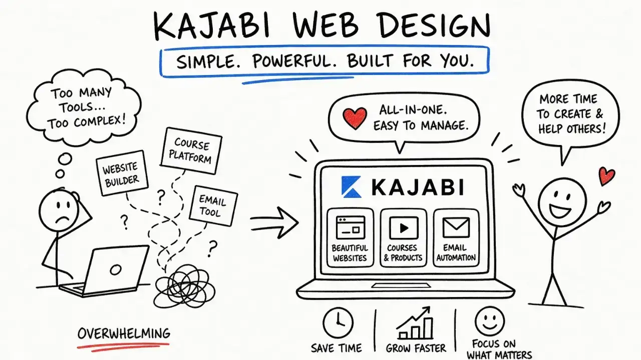
What Is Kajabi Website Design?
Kajabi website design is the process of planning, creating, and customizing your pages so visitors understand what you offer, trust your expertise, and know how to take the next step. It brings together your branding, messaging, page layouts, and the connections between your website, forms, checkout, and client experience.
You can build your site yourself, start with a template, or hire a Kajabi designer. Whichever route you choose, getting a website published is only part of the job. It also needs to help the right people become clients and customers.
Instead of working with one of the default Kajabi themes like the Encore or Taylor template, custom Kajabi website design gets you unique page layouts and a more on-brand feel than going it on your own can achieve.
Whether you're choosing to dive into Kajabi on your own or find Kajabi experts you can trust, I'm here to lay out everything you need to know that I've gleaned over years working as a Kajabi web designer. After designing hundreds of Kajabi websites, I've found most high-performing sites share common must-haves (below).
And no, these must-haves aren't particular themes, fonts, or color palettes. They're structural and visual decisions that make it easier for the right people to become clients and customers. This guide breaks down exactly what those decisions are and how to apply them to your own Kajabi website.
We're covering:
- Four design principles that make your website easier to understand and take action on.
- How to structure your homepage, sales pages, and opt-in pages around your visitors’ next steps.
- When to DIY, use a template, or hire a Kajabi expert based on your business, time, and support needs.
Remember, professional Kajabi website design goes beyond aesthetics when it comes to your pages. We need to focus on design that converts:
- Page layouts that guide visitors toward a specific action
- Content that removes the friction and confusion

Here at Sierra Lin Design, we specialize in done-for-you Kajabi builds for online business owners who don't want to choose between beautiful design AND strategy. When I dive into a Kajabi website design, I'm looking at every design decision as a revenue lever rather than an aesthetic choice. From your sections, to CTAs, and social proof and messaging... there's a LOT to consider when it comes to making your Kajabi website work for you.
While the baked in Kajabi copilot helper can work with you to get a site live fast, pick a theme, swap in your logo, and publish in an afternoon - speed and effectiveness are two different things.
Most course creators and coaches who build their own Kajabi sites end up with the same problem: a site that looks presentable but isn't doing much to boost your revenue. Visitors land on the homepage, browse a little, and then bounce.
In these cases, the Kajabi platform isn't the issue. The design decisions are.
What separates a high-converting Kajabi site from a pretty one comes down to two things: CTA placement and trust signal strategy. Getting both right is what separates a site that earns revenue from one that simply earns compliments.
If you're going it alone and DIY-ing your Kajabi website design, then you need to take back ownership of your website's conversion strategy.
Yes, ChatGPT, CoPilot, Claude, and all their AI friends can help a lot with brainstorming (and even Kajabi task doing). But, these tools cannot do the most important thing for Kajabi website success: ensure your website is focused on conversion.
Bookmark this guide, because we're going to take a deep dive into everything you need to know.
- Looking for more? Explore 5 of the Best Kajabi Features for Coaches.
Kajabi Website Design Principles Every Online Business Needs in 2026
Before you even touch a template or pick a font, you need to get a handle on the core design principles that separate sites that convert from sites that just look pretty (and don't do much else). Get these right, and the smaller decisions become a lot more streamlined.
Kajabi Website Design Principle #1 - Visual hierarchy and the first-scroll rule
Visual hierarchy is the order in which a visitor's eye moves across a page. On any Kajabi website, the most valuable real estate is everything visible before the first scroll. Or, "above the fold" in marketing terms.
Your headline, any subheadline, and primary call to action (Kajabi's term for buttons, but also the main next step you want people to take to work with you) need to do enough work in that space that a visitor immediately understands what you offer, who it's for, and what they should do next. If they have to scroll to figure that out, you've already lost the lead.
I like to call this website courtesy: Make things easy for your viewers to understand. When in doubt, choose clear over catchy or clever wording. And don't let fancy design touches like animations or graphics get in the way of your messaging.
The actual mechanics of design hierarchy are rather straightforward: large type draws the eye first, whitespace creates breathing room and signals importance, and contrast directs attention. Instead of scratching your head over design lingo, I'd rather you look at the top hero section of your website and ask yourself: Does this make sense to someone who has no idea what my business is about?
If you're in any doubt, clear things up by simplifying your messaging and design choices.
Less colors. Less font variation. Simple wording that anyone can understand in a second.
Kajabi Website Design Principle #2 - Brand consistency across every page type
I get a giggle when I read advice on branding like "just use your logo colors everywhere" 🤣
Brand design is about so much MORE than consistent colors and fonts. It's how your business feels to someone who's meeting you for the first time, and how that same personality carries through your photos, wording, layout, and client experience.
Visual brand strategy is so critical, that it's the first phase we dive into in our Kajabi Coach Accelerator process.
To keep things simple (or, to the bare minimum) make sure you have clarity on these visuals before setting up your Kajabi site:
- Color palette (include neutral tones as well as your primary and secondary brand colors). Plus, which colors you'll use for buttons, for headings, and for background sections.
- Fonts (or typography). Know which font you'll use for headings, paragraphs, and buttons.
A website visitor will land on your homepage, click through to a sales page, proceed to checkout, and then access their client portal... and so on, and on. You don't want it to feel like each of those pages was designed by a different person.
Instead, you want brand consistency. This means your font pairing, color palette, button styles, and overall visual tone carry through every page. You can do this on Kajabi through global style settings and site-wide branding controls, but it is not as easy to change your mind on colors and fonts later on compared to other website builders. She says as she cry-laughs typing into the keyboard... having had to click through dozens of landing pages to change the button color on each and every one 😅.
You'll save yourself a lot of time if you have the branding style ironed out before you start building.
HINT: If you're in a hurry and have no idea where to start with your visual brand, the fast get-er-done-yesterday option is to pick a free Kajabi template with colors and fonts you already like and work from there.
Kajabi Website Design Principle #3 - CTA placement (and where many sites mess this up!)
Many DIY Kajabi sites place one lonely call to action button at the bottom of a page, which means any visitor who doesn't scroll never sees it. Don't make your visitors search for the next step! Put your primary CTA front and center (above the fold) in the hero section.
All down the page, you want to repeat your primary CTA button. Viewers shouldn't have to scroll back up the page to get to a button. This is especially important in mobile design, where the screen size makes sections stretch even longer.
Everywhere you have your primary CTA button repeating, you should use the same verbiage. Don't switch between Book A Call and Schedule A Session. This consistent CTA phrasing, repeated at the right moments, generally outperforms a page scattered with different buttons competing for the same click.
Kajabi Website Design principle #4 - Trust signals to build that know, like, trust the RIGHT way (and not like a 2020 funnel)
Testimonials, client results, certifications, and logos all matter, but their placement matters as much as their presence. The principle is simple: put proof near friction. A testimonial placed directly beside a price point reduces hesitation more than the same testimonial isolated in its own section three scrolls away from anything the reader is evaluating.
Here's my designer pet peeve: Segregating all testimonials to one "Reviews" page. While I'm not against having a page dedicated to client results and case studies, that social proof should also be placed across your other website pages.
The 3 Kajabi pages that carry the most conversion weight
Not all pages are equal. Three page types do the heaviest lifting on any Kajabi site, and understanding what each one needs to accomplish is the difference between a site that works (cough, cough, converts) and one that just sits there collecting digital dust.
Your Kajabi Homepage: Help Visitors Find Their Next Step
The homepage has one job: let your visitors know if they are in the right place or not. The homepage should immediately tell viewers what you offer, who it is for, and what they should do next to work with you. The structure that works follows a clear sequence. A hero section with an outcome-focused headline sits at the top, followed by social proof placed close to the fold, an offer preview that shows your core program or service, and a single primary call to action repeated at logical points down the page.
(Are you sensing a pattern here? Knowing your primary CTA ("call to action") is critical before you start any designing. I can help you figure this out if you're not sure what yours should be.)
There's a quick test to know if you're being clear enough on your homepage. Ask yourself:
Would the content of my homepage immediately turn someone away who is not my ideal client?
Strategic design is just as much about who it turns away as it is about who it attracts. If your website messaging seems to say you help "everybody" with "everything," then you're not being specific enough to attract the right clients.
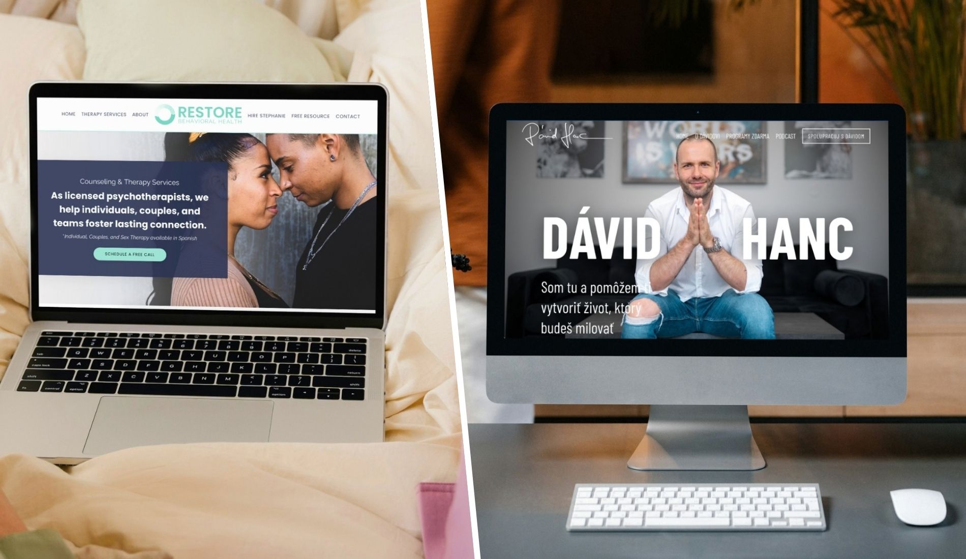
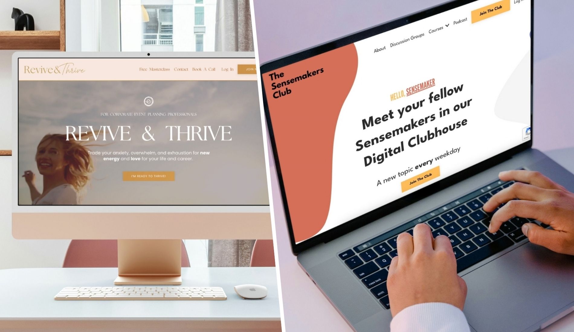
Need some inspo? Example Kajabi Websites:
Sales page structure that converts without pressure
A sales page is a page focused on one specific offer. This page is all about converting qualified visitors into buyers.
If you have more than one offer on a page, that's not a sales page--that's a shop page.
Sometimes, you'll see other marketers call the sales page a "landing page." If it's focused on selling one offer, same thing. Call it what you will.
A helpful starting structure for your Kajabi sales page
Use this as a starting point for the sections to add to your sales page, then adapt it to your offer and the questions your clients actually ask:
- Hero: Your offer, who it's for, and the next step. If a viewer's already ready to buy, don't make them scroll!
- Problem: What your client is looking for help with. I sometimes call this the "paint the picture" section, because you want to describe their current pain in excruciating clarity.
- Establish hope: Why what they've tried before has not worked, and why that's not their fault. We use hope based marketing here to relieve the shame and pressure your clients are likely feeling.
- Solution and offer: Introduce the solution (your unique fix) and your offer as the delivery method for that solution.
- Important distinction here: Your offer is not what to get excited about. "Oh look another program I can buy!" said no one ever. Instead, highlight the solution that gets them what they want. "An easy way to get promoted at work without asserting myself like an asshole?!" Now that's a solution! Your specific offer container (be it course, coaching, membership, or program) matters a whole lot less.
- About you: Why you're the person to guide them. Flaunt that authority, and show your personality. In the age of AI, people enjoy feeling like they know the people they're buying from.
- Social proof: Relevant client experiences. These can be written testimonials or social media screenshots. The best option is to include video testimonials.
- Features or modules: What's included and how it's delivered.
- Timing or bonus: Include this when there's a real deadline or relevant bonus.
- Purchase details: Pricing, payment options, and any actual guarantee or cancellation terms.
- FAQ: Answers to the questions that come up before booking or buying.
- Final CTA: Repeat the next step clearly.
The order of the sections on your sales page matters more than most people realize. Each section earns the right for the next one to land. Most sales pages that don't convert have a problem with the structure, not with the visual aesthetic.
Help people feel comfortable making a decision
Place client stories beside the parts of the offer they help explain. Keep pricing and payment details easy to find, and explain any guarantee accurately if you offer one. The goal is to help someone make an informed decision without needing to chase you for basic details.
Recommended resources:
- How to Create a High-Converting Kajabi Sales Page
- Kajabi Sales Page High Conversion Guide for Creators
- A Kajabi Funnel That Feels Like Luxury: Émilie Roberge's Case Study
Your Opt-In Page: Make Signing Up Simple
An opt-in page invites the visitor to exchange their email address for your lead magnet or freebie. This could be a free guide, quiz results, workshop, or checklist. Keep the page focused on that one invitation.
Just like the sales page should focus on one offer, the landing page should focus on one lead magnet. While many of my clients have several lead magnet resources, we find we get better conversions when each lead magnet has it's own devoted opt in landing page.
(I'm not saying you can't have a resources page on your website showcasing all of your available freebies. I'm just saying it won't convert as well as your individual opt in pages, so I recommend you build both.)
On your opt in page, explain the freebie clearly. Who it's for, and how it will help. A clear headline, a short explanation, an image of the resource, and a simple form are often enough to get started.
Use Kajabi's A/B landing page testing to try a shorter version of your opt in page against a longer version with more social proof. One page length can sometimes perform better than the other for different audiences, so you should test this to determine your own clients' preferences.
Think beyond the signup
- Make the promise specific. What will someone understand or be able to do after using your freebie?
- Keep the form simple. Ask for the information you actually need -- name and email. The more things you ask for (like a phone number, etc) the less it will convert.
- Explain what happens next. Tell them whether to check their inbox, download a file, or watch for event details.
- Test the full experience. Check the form, thank-you page, delivery email, and resource link before sharing the page.
And yes, this little page should still feel like you! Carry your branding through the signup, the thank-you page, and the email that arrives next. (You'll set up that delivery email via Kajabi sequence under the Email Marketing section of your dashboard)
More to read:
- Types of Kajabi Pages to Build First for Coaches
- Kajabi Pipeline Examples for Beginners
- Kajabi Pipeline Feature: Your 2026 Entrepreneur Guide
Before You Launch: Your Kajabi Website Checklist
Before you announce your new website to the world, give it a test drive on your phone and computer. And I mean your actual phone, not just the mobile preview inside Kajabi.
You know where everything lives because you built it. Your visitors? Not so much 🙃
Click through your website pages on your phone using this checklist to guide you:
-
Your first screen makes sense. Can someone immediately understand what you offer, who it's for, and what to do next? Check that your mobile layout keeps your headline and main button easy to find.
-
Text is comfortable to read. Nobody should need to pinch and zoom to understand your offer. Check headings, paragraphs, menus, and the smaller text inside forms.
-
Buttons are easy to tap. Give them enough space so visitors don't accidentally tap the wrong link. Make sure each button takes them to the right next step.
-
Everything fits the screen. Look for cropped images, overlapping text, and content that runs off the edge. If you use a comparison table, make sure it stacks neatly or scrolls within its own area on mobile.
-
Images load without a long wait. Resize and compress large photos before uploading them. Test your pages on your phone using cellular data, too, so you're not only judging speed on your speedy office Wi-Fi.
-
Your opt-in works from start to finish. Submit your form with a test email address. Check the thank-you page, delivery email, and download link. Did you receive what the page promised?
-
Booking and buying work, too. Follow your booking link and complete a test purchase where applicable. Confirm that the right confirmation, product access, and follow-up arrive.
-
Page titles and descriptions are customized. Give each public page a clear SEO title and description that explain its specific purpose. Check that you haven't left behind template wording or placeholder copy.
And (this is the most important mobile check you can do!) ask someone unfamiliar with your website to find an offer or sign up for your freebie without any help from you. Wherever they hesitate is a clue about what to make clearer.
A few small fixes now can save your future clients a whole lot of “Wait, where do I click?” later.
DIY, Template, or Done-for-You?
There are three realistic ways to get a Kajabi website built. The decision really comes down to where you are in your business and what you're actually trying to accomplish. All three approaches are valid. The important thing is choosing the right one for your specific situation rather than defaulting to one option out of habit or assumption.
1. Building your website yourself with Kajabi's page builder
Kajabi's built-in page builder is accessible and functional. DIY works well for early-stage testing, lean budgets, and founders who genuinely enjoy the process of building. The honest limitation is that without a strong design foundation, most DIY Kajabi sites end up looking like every other Kajabi site on the internet.
Kajabi's included site templates are usable starting points, but they rarely differentiate a brand in a competitive coaching or course market. The time investment is also significant, and the learning curve is steeper than Kajabi's marketing materials suggest.
I almost always hear clients say that Kajabi feels more difficult than other page builders like Squarespace, Showit or Wix. This is in big part due to the fact that Kajabi is not a drag and drop editor (you can't just place things where you want them on the screen).
Is it doable to learn for a beginner? Most definitely, as long as you're willing to set aside a significant amount of time setting things up and learning the new platform.
2. Starting with a premium (paid for) Kajabi template
A template gives you a structure to work from, which can make getting started feel much more manageable. You'll still need to add your own content and adapt the design to your brand.
Before choosing one, look at the pages it includes and how closely the layout fits the offer you're selling. The demo is a starting point; your wording, photos, and setup are what make it yours.
These templates can range all over the place in terms of pricing. As a Kajabi designer, I'm of course rather picky. I've had many a client come to me after downloading a template from etsy that totally WRECKED their Kajabi to clean up the mess.
Save yourself that headache, and start with a template provider you can trust.
Free: Download my bundle of FREE Kajabi templates (so you don't have to worry about wrecking your site!)
3. Bringing in done-for-you Kajabi design support
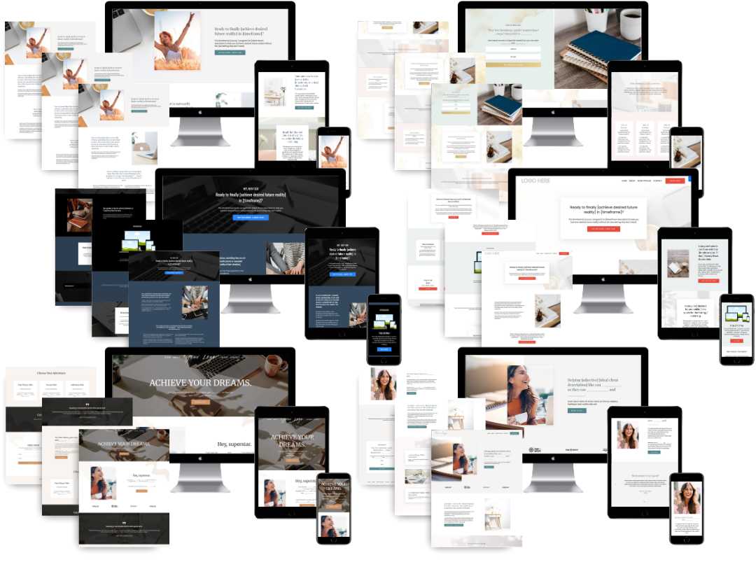
For coaches, course creators, and online business owners who want expert help bringing everything together, a Kajabi designer can handle your brand alignment, page design, messaging, mobile optimization, and behind-the-scenes setup.
Here at Sierra Lin Design, we specialize in Kajabi. Which saves you from paying for a general web designer to learn the platform on your project! 😉
And one of the best immediate wins I get to provide my clients? The weeks (sometimes months!) of time back in their business to spend on their zone of genius tasks.
Because you can learn to do all of this yourself. But if becoming a Kajabi designer wasn't on your business vision board, you don't have to make it your next career move. 😅
The value also extends beyond launch day. A thoughtfully built Kajabi website can help you get found through search, strengthen your reputation as a go-to in your industry, and create a cohesive brand experience. Pair that with forms, checkout, and follow-up emails that work together, and you have a system that nurtures leads and supports clients even when you're offline.
Of course, just a skosh biased over here. 😉 But I've also seen what happens when business owners spend years holding their Kajabi together on duct tape and prayers. By the time they ask for help, we're untangling old pages, disconnected automations, and customer journeys that no longer make sense.
Getting expert support early can save you from paying to rebuild those pieces later.
Pricing varies widely, so look closely at what's included. A few designed pages are a different scope from a complete brand, website, copywriting, and backend setup. Ask what your designer will handle, what you'll need to provide, and how they'll test everything before launch.
I prefer to quote clients on specifically what they need, and nothing that they don't. Your business is unique, after all! Your support should be too.
| What to consider | Buy a Premium Template | DIY Your Kajabi Website | Hire a Kajabi Expert |
|---|---|---|---|
| Upfront investment | Pay for the template, plus any setup support you need | Lowest cash investment, with more of your own time required | Higher upfront investment for professional strategy and implementation |
| Your time commitment | Moderate. You still add your content, customize the design, and connect everything | High. You handle planning, design, setup, and testing | Lower. You provide content and feedback while your expert handles the agreed scope |
| Design flexibility | Start with a polished layout and customize it within the template’s capabilities | Build around your skills and Kajabi’s available design tools | Get a design tailored to your brand, offers, and client experience |
| Website copy | Usually includes placeholders or prompts; you write the final copy | You write and organize all your content | May include copywriting or messaging guidance, depending on the package |
| Technical setup | Typically separate from the template purchase | You connect forms, offers, checkout pages, and emails | Can include setup and testing of your customer journey, depending on scope |
| Conversion strategy | Provides a starting layout, but you adapt it to your audience and offers | You decide how to guide visitors toward signing up or buying | An experienced expert can plan the pages and next steps around your business goals |
| Support | Usually limited to template use and installation | Kajabi resources, tutorials, and troubleshooting on your own | Personalized guidance, with training or ongoing support available in some packages |
| Best fit | You want a polished starting point and feel comfortable doing the setup | You have a smaller budget and time to learn and build | You want a cohesive website and backend with less hands-on work |
| Main trade-off | A template gives you the design foundation; implementation is still yours | You save on outside help but invest more time and effort | You invest more financially and need to choose an expert whose scope matches your needs |
More to explore:
- FREE Kajabi Templates: Download Now + How to Use Them
- Kajabi Done-For-You Services by Sierra Lin Design
- Kajabi Support Guide: Get Help + Expert Design
When It's Time to Bring in a Kajabi Designer
Any of the following ring a bell? These are the telltale signs I see that your DIY site might be holding your business back:
- Your website no longer reflects the quality of your offers.
- The branding feels different from one page to the next.
- People ask basic questions your pages should already answer.
- The mobile experience is hard to read or navigate.
- Your forms, checkout, or follow-up need attention.
- You and your team spend more time fighting your site than running your business.
You don't have to wait for everything to feel broken before asking for support. Sometimes you simply want an experienced set of eyes on what you've already built, and where you can optimize to pick more money up off the table.
What to look for in a Kajabi designer
Look for a portfolio of Kajabi-specific work and ask what the designer handled in those projects. Page design, copywriting, course setup, and automations are different parts of the work, so get clear on which ones your project includes.
- Can they show you relevant Kajabi examples?
- How do they plan your visitors' next steps?
- What will they handle, and what will you need to provide?
- How do they check mobile layouts and the signup or purchase experience?
- What training and support will you have after launch?
Recommended reading:
- The Best Kajabi Experts To Follow and Work With
- Boost Your Small Business Success with a Professional Kajabi Website Designer
How We Help at Sierra Lin Design
When we build your Kajabi website, we're also completing your branding, sales messaging, and behind-the-scenes setup that support it. The full she-bang, as I like to say.
The Kajabi Coach Accelerator process brings those pieces into one project, with the scope tailored to your business and offers.
- Offer and product positioning
- Visual brand design
- SEO-informed website copywriting
- Custom Kajabi website and system pages
- Client-flow planning and automations
- Launch planning, training, and post-launch support
Explore Kajabi Coach Accelerator and what’s included →
Let's Talk About Your Kajabi Website
Want help figuring out what your Kajabi website needs next? Book a free call so we can talk about your business, your offers, and what you’d love your website to do for you.
I’d love to hear what you’re working on!
 Sierra Janisse · Kajabi Designer, Kajabi Expert, & Kajabi Website Designer
Sierra Janisse is a verified Kajabi Expert who helps online business owners build profitable websites on Kajabi. From SEO and copywriting to website design, branding, automations and funnel strategy, she is the go-to expert for Kajabi users who want to attract more clients and customers with their websites.
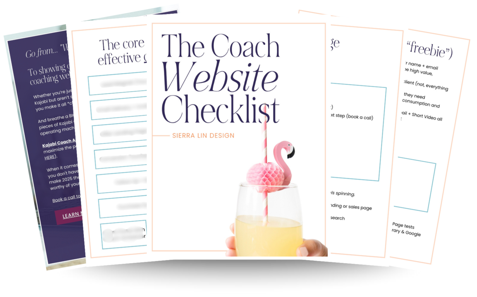
🚨Get the FREE Checklist
Skip the Kajabi tears—Swipe the free Website Checklist & Funnel Map
Exactly what should go where on your Kajabi site to maximize leads.