Kajabi Sales Page High Conversion Guide for Creators

A high-converting Kajabi sales page is a single, focused page designed to guide visitors toward one clear action: buying your course or membership. This kajabi sales page high conversion guide covers every element that separates pages that quietly collect dust from pages that generate consistent revenue. You will learn the structural foundations, Kajabi-specific tools, copy frameworks, and step-by-step build process that course creators and coaches are using right now to increase conversion rates on Kajabi. The principles here are grounded in 2026 industry data and real-world funnel performance.
What core elements make a Kajabi sales page convert well?
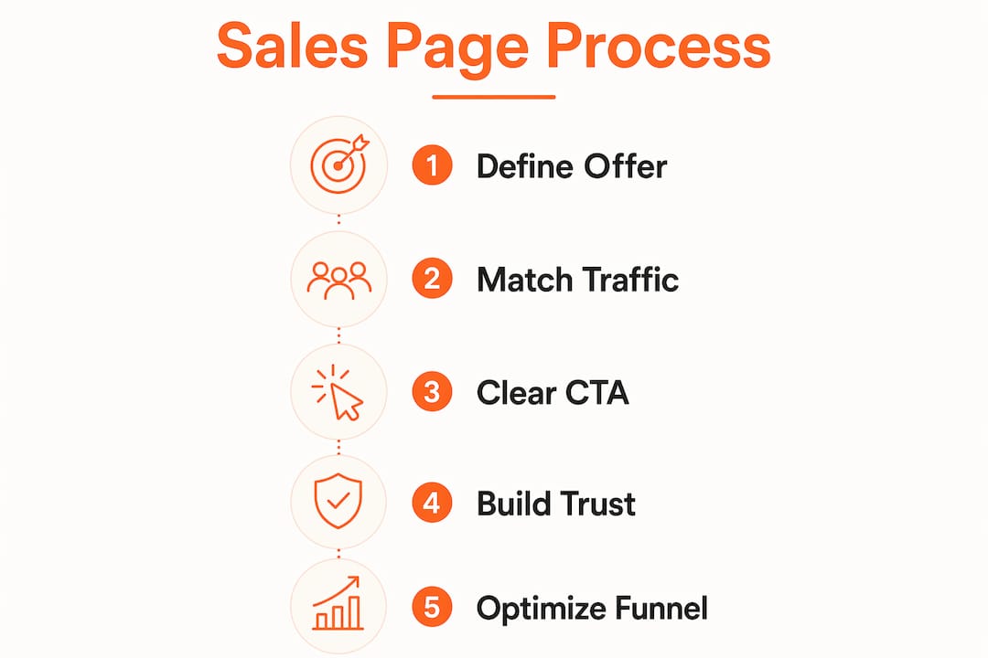
A high-converting sales page is built on four pillars: relevance, clarity, trust, and a single focused action. Remove any one of these and your conversion rate drops. High-converting landing pages share a consistent structure: a matched headline, social proof above the fold, a mobile-first layout, and one call to action repeated strategically. Pattern recognition, not creative genius, drives results here.
Your headline must mirror the source of traffic. If someone clicks a Facebook ad about "doubling your coaching income," your headline needs to reflect that exact promise. A mismatch between ad and page is one of the most common reasons visitors bounce within seconds.

Place a relevant testimonial near your main offer introduction, and add more detailed client stories where they help answer questions. Choose examples that relate directly to the audience and offer on the page.
Here are the core elements every high-converting Kajabi sales page needs:
- Matched headline: Reflects the exact promise from your traffic source
- Outcome-focused offer: Describes the transformation, not the features
- Social proof above the fold: Testimonials, stats, or client logos placed early
- Single primary CTA: One button, one action, repeated 2–3 times down the page
- Clean visual hierarchy: Whitespace, bold subheads, and short paragraphs guide the eye
- Mobile-first design: Most course buyers browse on their phones first
- Minimal distractions: No navigation menus, no sidebar links, no exit routes
Pro Tip: Apply a subtraction mindset before you publish. Remove every element that does not directly support the sale. If it does not build trust, clarify the offer, or push toward the CTA, cut it.
Conversion rates vary by funnel type. Webinar registration funnels convert at a median of 11.4%, while lead-gen flows sit at 6.8%. This means your benchmark for success depends on what you are selling and how you are driving traffic.
Which Kajabi tools and features boost sales funnel performance?
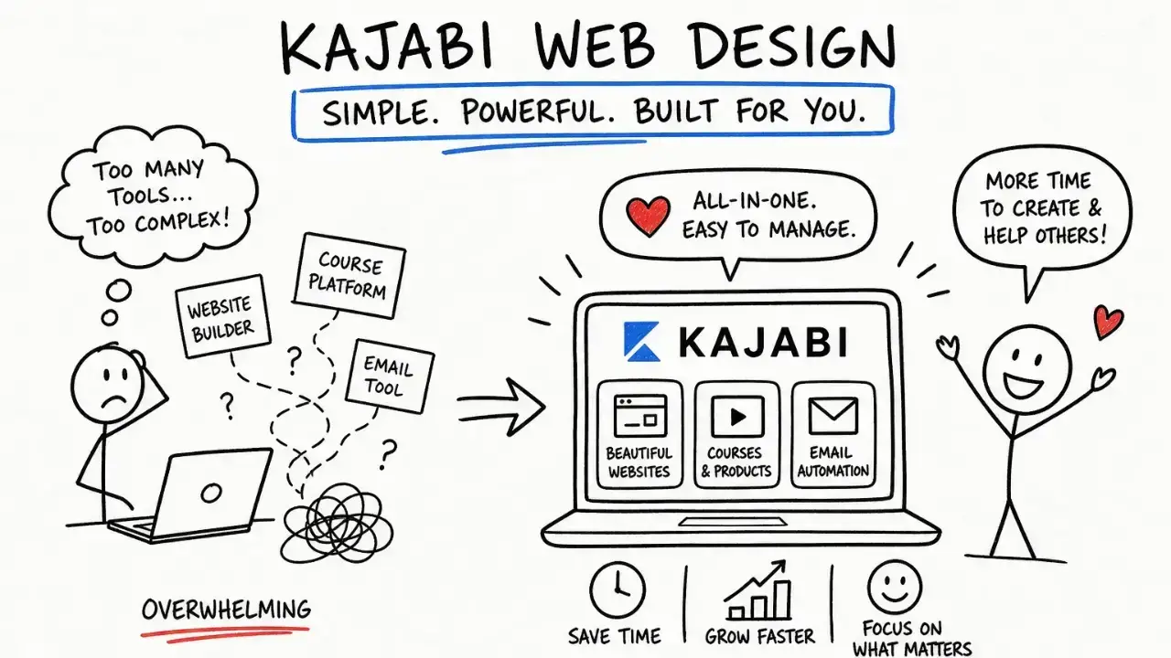
Kajabi gives you several built-in tools that go beyond a basic page builder. Used correctly, they turn a decent sales page into a complete revenue system.
Here is how to use each one effectively:
-
Upsell pages: Kajabi's post-purchase upsell system targets a take rate of 10–25% and an average order value lift of 15–40%. That means for every 100 buyers, 10–25 will add a second offer without you doing any extra selling.
-
Focused opt-in pages: Remove your site navigation entirely on opt-in and sales pages. Focused opt-in pages without secondary navigation deliver 2–3 times higher conversion rates than cluttered pages. This is one of the fastest wins available in Kajabi.
-
Kajabi templates and style guide: Use Kajabi's customizable templates as a starting point, then apply your brand's color palette, fonts, and imagery consistently. Consistency builds recognition and trust across your entire funnel.
-
Post-purchase flows: Set up automated email sequences that trigger immediately after a purchase. These flows reduce buyer's remorse, deliver the product experience quickly, and prime buyers for your next offer.
-
Kajabi analytics: Track page views, opt-in rates, and sales conversion rates inside your Kajabi dashboard. Set a weekly review cadence so you catch underperforming pages before they drain your ad spend.
| Kajabi feature | Primary benefit | Target metric |
|---|---|---|
| Upsell pages | Increases average order value | 10–25% take rate |
| Focused opt-in pages | Removes distraction, lifts conversions | 2–3x higher conversion |
| Post-purchase email flows | Reduces churn, builds loyalty | Open rate above 40% |
| Built-in analytics | Tracks funnel performance | Weekly review cadence |
The checkout experience is also part of your funnel. A well-designed Kajabi checkout page reduces cart abandonment and keeps buyers moving forward without second-guessing their decision.
How to write compelling sales copy for Kajabi pages
Strong sales copy answers the buyer's biggest question first: "What will my life look like after I buy this?" Every other element of the page supports that answer.
The structure that works consistently follows this arc: attention, problem, solution, proof, offer, CTA. You open with a headline that grabs attention. You name the problem your buyer is living with right now. You position your course or membership as the solution. You prove it with testimonials and results. You present the offer with clear pricing and bonuses. Then you ask for the sale.
Here is what separates copy that converts from copy that just fills space:
- Outcome over features: "You will sign your first three clients in 30 days" beats "This course includes 12 modules and a workbook."
- Specific social proof: "I went from $0 to $8,400 in my first launch" beats "This course changed my life."
- Objection handling: Address the top two or three reasons someone would not buy. Write them out and answer them directly on the page.
- Transformation arc: Show the before state, the turning point, and the after state. Buyers buy the after.
- Precise CTAs: Tell readers what happens when they click. Use a label that matches the action, such as "Get instant access" for an immediately available course.
Pro Tip: Use ChatGPT or another AI tool to draft your initial copy structure and outline. Then rewrite every sentence in your own voice. AI tools excel at structure but require manual editing to carry emotional resonance and brand alignment, especially for high-ticket offers.
CRO underperformance often comes from vague claims, not poor design. Replacing generic stock images with specific client results and swapping vague CTAs for precise offers significantly improves conversion. Specificity is the single most underused tool in sales copy.
You can go deeper on copy structure in this guide on writing a sales page that converts, which walks through the full framework with examples.
What step-by-step process builds a high-converting Kajabi sales page?
Building a page that converts is a process, not a one-time event. Follow these steps in order and you will avoid the most common pitfalls.
-
Clarify your offer and audience. Write one sentence that describes who this is for, what they get, and what changes for them. If you cannot write that sentence clearly, your page will not convert.
-
Choose your Kajabi template. Pick a template that matches your offer type: a long-form sales page for high-ticket programs, a shorter opt-in page for free lead magnets. Apply your brand style guide immediately so the page feels like yours.
-
Write copy before you design. Drop your copy into the page first, then adjust design around it. Designers who build before writing end up with beautiful pages that say nothing.
-
Place social proof strategically. Put your strongest testimonial or result above the fold. Add two or three more throughout the page, especially near the CTA.
-
Optimize for mobile. Preview your page on a phone before publishing. Check that buttons are large enough to tap, text is readable without zooming, and images load quickly.
-
Minimize form fields. Each additional form field acts as a friction point on conversion. Ask only for what you need at the point of opt-in. Collect additional information later through progressive profiling.
-
Test one element at a time. Change your headline first and run it for at least two weeks before testing anything else. Testing multiple elements at once makes it impossible to know what moved the needle.
-
Review analytics weekly. Check your Kajabi dashboard for page views, opt-in rates, and sales. A drop in opt-in rate usually points to a headline or traffic mismatch. A drop in sales conversion usually points to copy or offer clarity.
The most common pitfall is overloading the page with options. One offer, one CTA, one outcome. A page that tries to sell three things at once sells none of them. Keep the sales page structure tight and let the copy do the work.
Key takeaways
A high-converting Kajabi sales page requires a matched headline, specific social proof above the fold, outcome-focused copy, and a single CTA repeated strategically throughout the page.
| Point | Details |
|---|---|
| Match headline to traffic source | Mismatched headlines cause immediate bounces; reflect the exact ad or email promise. |
| Remove navigation from sales pages | Focused pages without menus convert 2–3 times better than cluttered alternatives. |
| Use Kajabi upsells post-purchase | Target a 10–25% take rate to lift average order value by 15–40% without extra selling. |
| Write outcome-focused copy | Describe the transformation buyers get, not the features of your course or program. |
| Test one element at a time | Isolate variables like headlines or CTAs and run each test for at least two weeks. |
What I have learned about conversion that most guides skip
Most conversion advice focuses on tactics: button colors, headline formulas, countdown timers. Those things matter at the margins. What actually moves the needle is whether your page makes the right person feel seen.
I have worked with coaches and course creators on Kajabi pages across a wide range of niches. The pages that consistently underperform share one trait: they describe the product instead of the person. They list modules, hours of content, and bonus PDFs. The buyer does not care about any of that until they believe the page understands their problem.
The upsell piece is where I see the most fear. Business owners worry that adding a post-purchase offer will feel pushy or damage trust. The opposite is true when done right. The post-purchase moment is the highest-trust window in the entire funnel. Your buyer just said yes to you. A relevant, low-friction upsell with an easy "No thanks" option respects that trust and adds real value.
The other thing I want to flag is AI copy. I use it. You should use it. But I have seen too many Kajabi sales pages that read like they were written by a committee of robots. AI gives you a scaffold. Your voice, your story, and your client results are what make someone click buy. Edit ruthlessly until the page sounds like you talking to one specific person.
Brand alignment is not a design preference. It is a conversion factor. When your page looks and sounds like the rest of your brand, buyers feel safe. When it looks like a generic template with your logo slapped on, they hesitate. That hesitation costs you sales.
How Sierra Lin Design helps you build pages that actually sell
If you have read this far and you are thinking "I know what needs to happen, I just need someone to build it right," that is exactly where Sierra Lin Design comes in. Sierra Lin Design works with online business owners to build custom Kajabi pages designed around your offer, your brand, and your buyers. No cookie-cutter templates, no tech headaches, and no six-month timelines.
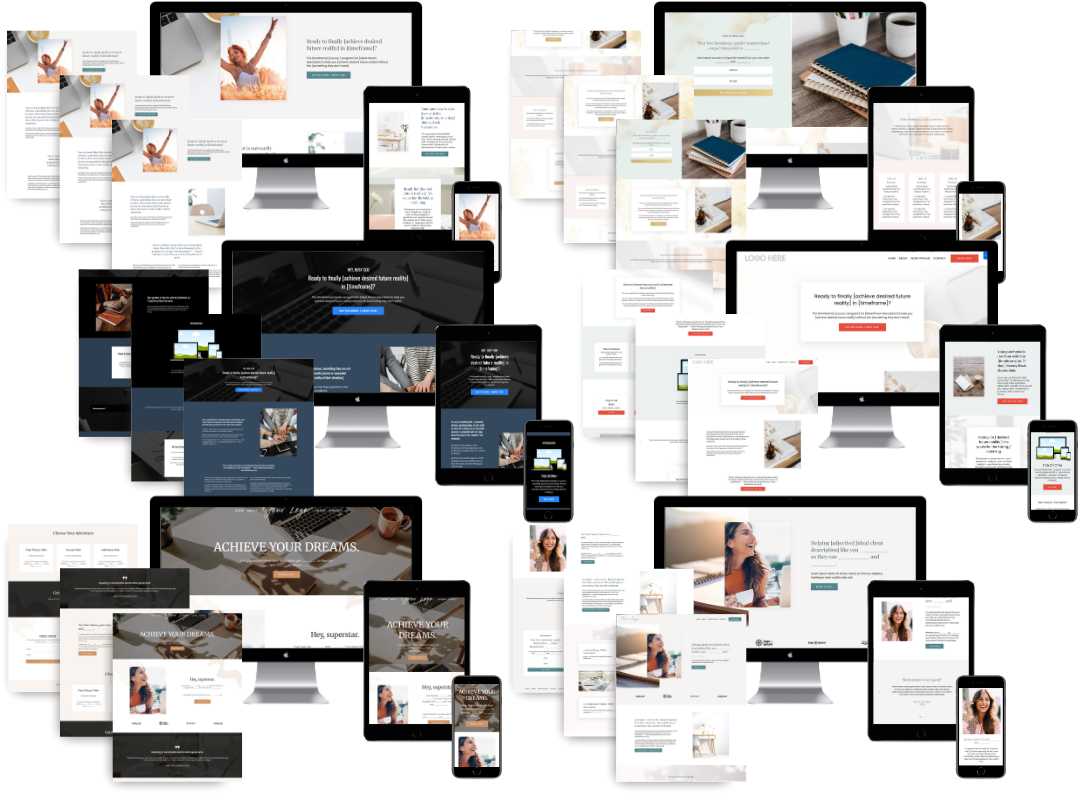
You can start right now with the free Kajabi sales page templates built specifically for Kajabi users. If you are ready for a fully custom build, the custom Kajabi web design services walks you through what a done-for-you Kajabi website looks like from strategy to launch.
FAQ
What is a good conversion rate for a Kajabi sales page?
Conversion rates vary by funnel type. Webinar registration funnels average 11.4% and lead-gen flows average 6.8%, based on a 2026 study of 2,000 landing pages. Use these as benchmarks, not guarantees.
How many CTAs should a Kajabi sales page have?
One primary CTA, repeated two to three times down the page. Specificity in the CTA wording matters more than quantity. Generic "Buy Now" buttons underperform compared to action-specific phrases aligned to your offer.
Should I remove the navigation menu from my Kajabi sales page?
Yes. Focused pages without secondary navigation convert 2–3 times better than pages with menus. Kajabi lets you hide the header and footer on any page, and you should use that feature on every sales and opt-in page.
Can I use AI to write my Kajabi sales page copy?
AI tools work well for drafting structure and strategy. Manual editing is required to align the copy with your brand voice and emotional tone, especially for high-ticket coaching offers where trust is the primary buying factor.
How do Kajabi upsells affect buyer trust?
Relevant upsells offered immediately after purchase, with a clear and easy "No thanks" option, build trust rather than damage it. The post-purchase window is the highest-trust moment in your funnel, making it the right time to present a complementary offer.
Recommended
 Sierra Janisse · Founder of Sierra Lin Design
Sierra Janisse is a verified Kajabi Expert who helps online business owners build profitable websites on Kajabi. From SEO and copywriting to website design, branding, automations and funnel strategy, she is the go-to expert for Kajabi users who want to attract more clients and customers with their websites.
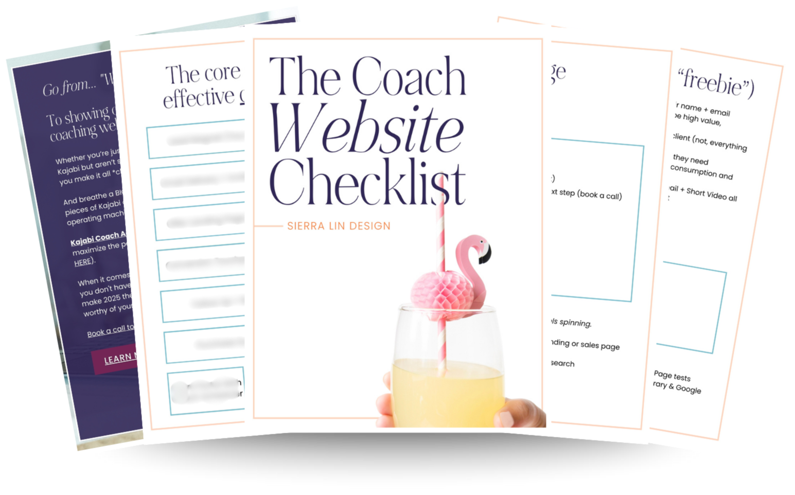
🚨Get the FREE Checklist
Skip the Kajabi tears—Swipe the free Website Checklist & Funnel Map
Exactly what should go where on your Kajabi site to maximize leads.