Mobile-First Website Design: What It Is and Why It Matters

Mobile-first website design means you start building for the smallest screen first, then scale up. Instead of designing a full desktop layout and squeezing it down to fit a phone, you begin with a smartphone viewport, decide what truly matters, and progressively add features as screen size grows.
The approach was first proposed in 2009 by Luke Wroblewski, then Google's Product Director, who argued that designing for mobile constraints forces better decisions across the entire product. As of 2026, mobile traffic exceeds 60% of global web usage, which makes starting anywhere else increasingly hard to justify.
The core elements of mobile-first design come down to a few non-negotiables:
- Progressive enhancement: Build a fully functional base experience for mobile, then layer in richer features for tablets and desktops.
- Touch-friendly interfaces: Every interactive element is sized and spaced for fingers, not cursors.
- Content prioritization: Only what the user genuinely needs appears on the initial view. Everything else is secondary.
- Performance by default: Lean code, optimized assets, and fast load times are baked in from the start, not added later.
- Accessibility: Plan for readable text, clear labels, keyboard navigation, and controls that are easy to use on a small screen.
What is mobile-first website design, and why does it matter now?
Google indexes and ranks your site based on its mobile version first. That shift, called mobile-first indexing, means your desktop experience is largely irrelevant to how you rank. Pair that with Core Web Vitals, which Google measures primarily on mobile devices, and the SEO case for a mobile-first approach becomes impossible to ignore.
Beyond rankings, user expectations have moved fast. People expect a site to load, respond, and feel intuitive on their phone without any friction. 53% of mobile users abandon sites that take more than 3 seconds to load. That is not a patience problem. It is a design problem, and mobile-first solves it at the source.
For coaches and online service providers, this hits especially close to home. A potential client discovers you on Instagram, taps your link, and lands on your site from their phone. If that experience is clunky, slow, or hard to navigate, they are gone before they ever read your offer. Your website's role in your coaching business depends entirely on whether it works where your audience actually shows up.
How to implement mobile-first design step by step
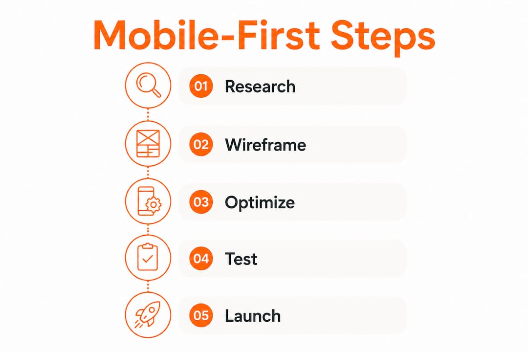
Getting this right is less about tools and more about sequence. Here is the process that actually works:
- Start with the smallest viewport. Sketch or wireframe for a ~375px wide screen. This is where your decisions get real.
- Do a content inventory. List every piece of content on the page and cut anything that does not serve the user's primary goal. If it does not earn its place on mobile, it probably does not belong anywhere.
- Design for touch first. Buttons, links, and form fields need to be large enough to tap without frustration. More on exact sizing in the best practices section below.
- Write mobile-first CSS. Start with base styles that apply to all screens, then use
min-widthmedia queries to progressively enhance for larger viewports. This is the technical backbone of the approach. - Layer in progressive enhancement. Add richer layouts, additional content, hover states, and complex animations only as screen size increases. The mobile experience should never depend on features that only work on desktop.
- Optimize every asset. Compress images, defer non-critical scripts, and keep your CSS lean. Performance is not a finishing step. It is built in from the beginning.
- Test on real devices. Emulators catch some issues, but real device testing reveals the usability problems that simulators miss entirely.
Pro Tip: When you wireframe for mobile first, use your actual thumb to check reach zones on your phone. If a key action like "Book a call" falls outside comfortable thumb reach, move it before you ever open a design tool.
How mobile-first design differs from responsive web design
These two terms get used interchangeably, but they describe very different things. Responsive design is a technical approach. It means a layout adapts to different screen sizes using flexible grids, fluid images, and CSS media queries. Mobile-first design is a strategic philosophy, not just a technical method. It determines where you start and what you prioritize.

A responsive site built desktop-first often starts with a rich, complex layout and then tries to compress it for smaller screens. That process, called graceful degradation, tends to produce mobile experiences that feel like afterthoughts. Mobile-first flips it: you build the leanest, most focused version first, then progressively enhance for larger screens.
| Dimension | Mobile-first design | Desktop-first responsive design |
|---|---|---|
| Starting point | Smallest screen (~375px) | Largest screen (tablet and desktop) |
| Content approach | Prioritize essentials only | Include everything, then cut |
| Performance | Lean by default | Often requires retrofitting |
| User intent focus | Mobile habits and touch | Desktop interactions first |
| CSS approach | min-width media queries |
max-width media queries |
| Code complexity | Simpler base, enhanced up | Complex base, stripped down |
The key takeaway: you can have a responsive site that is not mobile-first, but a mobile-first site is always responsive. They are not the same thing.
Best practices that actually make mobile-first design work
Knowing the philosophy is one thing. Executing it cleanly is another. These are the practices that separate a polished mobile experience from one that just technically fits on a small screen.
- Nail your content hierarchy. The most important information goes first, every time. On a coaching site, that usually means your headline, your core promise, and a clear call to action before anything else.
- Size touch targets correctly. Apple's Human Interface Guidelines set the minimum at 44x44 pixels. Material Design sets it at 48x48 pixels. Either way, small tappable elements cause errors and frustration.
- Keep navigation in the thumb zone. The bottom third of a phone screen is where thumbs naturally rest. Primary navigation and key actions belong there, not buried at the top.
- Use progressive disclosure. Show users what they need right now. Reveal additional detail on demand, not all at once. This keeps initial views clean and focused.
- Simplify forms aggressively. Every extra field you add on mobile costs you conversions. Ask only for what you absolutely need.
- Focus on the critical rendering path. Load what the user sees first, fast. Defer everything else.
- Validate with real analytics. Tools like Google Analytics 4 and Hotjar show you exactly how mobile visitors behave on your site. Use that data to refine, not guess.
For coaches building on Kajabi, these principles apply directly to your offer pages, sales funnels, and opt-in forms. A well-structured Kajabi offer page built with mobile-first thinking converts at a different level than one designed for desktop and adapted down.
The real benefits of building mobile-first from the start
The advantages compound quickly once you commit to this approach.
- Faster load times for everyone. Lean mobile code benefits desktop users too. A site built mobile-first loads lighter across all devices.
- Better search rankings. Aligning with Google's mobile-first indexing and Core Web Vitals directly supports your SEO. Website speed affects coaching sales more than most coaches realize.
- Higher engagement. Focused content and touch-friendly design keep visitors on the page longer and moving toward your offer.
- Stronger accessibility. Mobile-first design naturally aligns with WCAG 2.2 standards, making your site usable for more people.
- Cleaner development. Starting simple and building up is faster and less error-prone than starting complex and cutting down.
- Strategic product clarity. Forcing yourself to decide what belongs on the mobile view eliminates feature bloat before it starts.
Expert perspective on mobile-first strategy and implementation
The most underrated thing about mobile-first design is what it does to your thinking, not just your layout. Luke Wroblewski put it plainly: designing for mobile forces focus and enables innovation because constraints demand decisions. When you cannot fit everything, you figure out what actually matters. That discipline carries over into every other part of your site.
Performance optimization is not a separate concern in mobile-first design. It is built into the workflow. Optimized images, lean CSS, and deferred non-critical scripts are natural outputs of starting with a constrained environment. You are not retrofitting performance later. You are building it in from the first line of code.
A common mistake is treating mobile-first as just a CSS technique, writing min-width queries and calling it done. The real work is in the content and UX decisions made before a single line of code is written. What does this user need to do? What can wait? What should never appear at all? Those questions, answered honestly, are what make a mobile-first site feel genuinely good to use.
Pro Tip: Before designing any new page, write out the single most important action you want a mobile visitor to take. Build the entire page around making that one action obvious and easy. Everything else is supporting cast.
At Sierra Lin Design, we approach every Kajabi build to be responsive from the get-go. The web design principles for coaches we follow start with mobile clarity, because that is where your clients are when they first find you.
Challenges and common pitfalls to watch for
Mobile-first design is not without friction, especially if your team or platform is accustomed to desktop-first workflows.
The biggest pitfall is treating mobile as a stripped-down version of desktop rather than its own complete experience. When teams start with a desktop design and try to adapt it down, they end up making compromises that hurt mobile users. Content gets hidden, navigation becomes awkward, and performance suffers.
Another common issue is over-relying on emulators. Browser developer tools are useful for quick checks, but they do not replicate real device behavior, actual network conditions, or the physical experience of using a thumb on glass. Real device testing is the only way to catch what matters.
Designers also frequently underestimate how much content needs to be cut. The instinct is to keep everything and just restack it vertically. But a long, scrolling mobile page with too much content is just as problematic as a cluttered desktop page. Ruthless prioritization is the skill that separates good mobile-first work from mediocre work.
Finally, accessibility often gets deprioritized under deadline pressure. Skipping proper contrast ratios, missing alt text, or using tiny tap targets creates real barriers for users and creates SEO problems at the same time.
Real-world examples of mobile-first design done well
Some of the most visited sites on the internet built their success on mobile-first principles. Google's own search interface is a textbook example: one input field, one button, nothing else competing for attention. The mobile experience is the experience, and the desktop version simply has more room to breathe.
Airbnb rebuilt its product with a mobile-first approach and saw measurable improvements in booking conversion on phones. The redesign focused on reducing steps, simplifying navigation, and making the core task, finding and booking a place, as direct as possible on a small screen.

For coaches and consultants, the same principle applies at a smaller scale. A coaching site that loads fast, leads with a clear headline, and places the "Book a call" button where a thumb naturally lands will outperform a visually impressive desktop site that takes four seconds to load on a phone. The design flexibility Kajabi offers makes it possible to build exactly this kind of focused, mobile-first experience without custom code.
Tools and frameworks that support mobile-first development
Several tools make mobile-first workflows significantly easier to execute.
Figma is the industry standard for mobile-first UI design. You set your artboard to 375px wide, design the mobile view completely, then duplicate and expand for tablet and desktop. Its auto-layout feature handles responsive behavior cleanly.
Tailwind CSS is built around a mobile-first utility class system. Every utility applies to mobile by default, and you add responsive prefixes (md:, lg:) to target larger screens. This enforces mobile-first thinking at the code level.
Bootstrap 5 uses a mobile-first grid system with min-width breakpoints, making it straightforward to build responsive layouts that start from the smallest screen.
For testing, BrowserStack lets you run your site on real physical devices without owning them, which is the closest thing to actual user testing you can do remotely. Google Lighthouse audits your Core Web Vitals, accessibility, and performance scores directly in Chrome DevTools, giving you a clear picture of where your mobile experience stands.
Google Analytics 4 and Hotjar round out the toolkit by showing you how real mobile visitors actually use your site, where they drop off, and what they tap most.
Performance optimization techniques built for mobile-first
Performance and mobile-first design are inseparable. Here is where the technical work pays off most directly.
Image optimization is the single highest-impact change most sites can make. Use modern formats like WebP, serve appropriately sized images for each viewport using srcset, and lazy-load anything below the fold.
Critical CSS means inlining only the styles needed to render the above-the-fold content, then loading the rest asynchronously. This dramatically reduces the time to first meaningful paint on slow mobile connections.
Deferred JavaScript keeps non-critical scripts from blocking page rendering. Anything that does not affect the initial view should load after the page is visible.
System fonts eliminate font-loading delays entirely. If your brand allows it, using the device's native font stack removes one of the most common causes of layout shift and slow rendering.
Content Delivery Networks (CDNs) serve your assets from servers geographically close to your visitor, cutting latency on every request. For coaches with a global audience, this is a straightforward performance win.
The goal across all of these is the same: get the user to a usable page as fast as possible, especially on a slower mobile connection. Every second you shave off load time directly affects whether a potential client stays or leaves.
If you are ready to build a Kajabi site that works beautifully on mobile from day one, Sierra Lin Design's custom design services are built exactly for coaches, consultants, and course creators who want a site that performs, not just looks good on a laptop.
Key Takeaways
Mobile-first website design starts with the smallest screen, forces content prioritization, and produces faster, more accessible sites that rank better in Google search.
| Point | Details |
|---|---|
| Start with mobile constraints | Design for ~375px viewports first, then progressively enhance for larger screens. |
| 60% of web traffic is mobile | Over 60% of global web usage comes from mobile devices as of 2026. |
| 3-second load rule | 53% of mobile users abandon sites that take more than 3 seconds to load. |
| Touch targets need minimum sizing | Tap targets should be at least 44x44px (Apple) or 48x48px (Material Design) to prevent errors. |
| Mobile-first differs from responsive | Responsive design adapts layouts technically; mobile-first is a strategic starting point focused on mobile user needs. |
FAQ
Is mobile-first design better than desktop-first?
Yes, for most modern websites. Mobile-first produces leaner code, faster load times, and better alignment with Google's mobile-first indexing, which directly affects search rankings.
When did mobile-first web design start?
Luke Wroblewski introduced the mobile-first concept in 2009, arguing that designing for mobile constraints before desktop leads to cleaner, more focused digital products.
Why is mobile-first design no longer optional?
Google ranks sites based on their mobile version through mobile-first indexing, and over 60% of global web traffic now comes from mobile devices, making mobile performance a direct business requirement.
How do you design a mobile-first website?
Start by wireframing for a ~375px viewport, prioritize only essential content, use min-width CSS media queries to scale up, and test on real devices before launch.
Recommended
 Sierra Janisse · Kajabi Designer, Kajabi Expert, & Kajabi Website Designer
Sierra Janisse is a verified Kajabi Expert who helps online business owners build profitable websites on Kajabi. From SEO and copywriting to website design, branding, automations and funnel strategy, she is the go-to expert for Kajabi users who want to attract more clients and customers with their websites.

🚨Get the FREE Checklist
Skip the Kajabi tears—Swipe the free Website Checklist & Funnel Map
Exactly what should go where on your Kajabi site to maximize leads.