Why Site Architecture Matters for Coaches' Websites

Site architecture for coaches is the strategic design of a website's layout, navigation, and page structure that determines how easily potential clients find information and take action. Most coaches treat their website like a digital business card. The ones who grow their client base treat it like an operating system. Understanding why site architecture matters for coaches means recognizing that your website's structure directly controls whether a visitor books a call or clicks away. The difference between those two outcomes often comes down to how your pages connect, how fast your site loads, and whether your booking flow has friction.
Why site architecture matters for coaches: the core framework
Information architecture, the formal term for how content is organized and linked across a website, is the foundation every coaching website needs before any design work begins. Without it, even a beautiful site fails to convert visitors into clients. The structure you choose determines your site's usability, your Google search ranking, and your client's first impression of your professionalism.
A coaching website built on solid information architecture has six core pages: Home, About, Services, Booking or Contact, Blog, and Privacy Policy. Each page serves a specific role in the client acquisition process. The Home page filters visitors, the Services page qualifies them, and the Booking page closes them. Miss any of these, and you have a gap in your client flow.

Booking must be accessible within three clicks from any page on your site. That single rule eliminates more conversion problems than any design tweak. When a potential client has to hunt for your scheduling link, they stop hunting and leave.
Pro Tip: Map your site's navigation before you build a single page. Write out every page name and draw arrows showing how a visitor moves from landing on your homepage to completing a booking. If the path takes more than three steps, simplify it.
The technical side of architecture matters just as much as the structural side. Google PageSpeed scores below 80 on mobile cause your site to rank lower and lose visitors before they read a single word. A Google PageSpeed mobile score of 80 or above is the baseline for staying visible in search results. That means your site's architecture must account for image sizes, font loading, and script placement from the start, not as an afterthought.
How does site architecture affect client trust and conversion?
75% of people judge a business's credibility based on its website design. That statistic means your site's layout is doing sales work before you say a single word to a prospect. A cluttered navigation menu, a slow-loading page, or a buried contact link all signal disorganization, and disorganization kills trust.
The relationship between site structure and trust works through three specific mechanisms:
- Visual hierarchy: Your most important content, your value proposition and your booking CTA, must dominate the page. Navigation clarity and strategic visual hierarchy are critical to converting visitors into clients. Secondary information like blog posts and FAQs belongs lower on the page or in supporting sections.
- Consistent navigation: When your menu changes between pages or your CTA buttons use different labels, visitors feel disoriented. Consistent navigation builds the subconscious sense that you run a tight, reliable operation.
- Mobile optimization: More than half of web traffic comes from mobile devices. A site that breaks on a phone tells a potential client that you haven't thought about their experience. That impression transfers directly to how they imagine working with you.
Integrated booking and intake workflows remove the friction that causes drop-offs between interest and commitment. Disconnected tools create friction that causes prospects to abandon the process between expressing interest and completing a booking. When your scheduling tool, payment processor, and intake form live inside one connected system, the client moves from "I'm interested" to "I'm booked" without hitting a single dead end.
Coaching blogs generate 67% more monthly leads than sites without one. That number reflects how a well-placed blog page, connected logically to your services and booking flow, builds organic traffic and warms up potential clients before they ever speak to you.
Common architectural mistakes coaches make on their websites
Most coaches make the same structural errors, and those errors cost them clients every single week. Recognizing the pattern is the first step to fixing it.
-
Treating the site as a brochure. A brochure displays information. A business system processes clients. Most coaches mistakenly treat their website as a brochure rather than an operating system that integrates marketing and client delivery workflows. The result is a site that looks fine but generates no revenue.
-
Burying the booking link. The most common failure in coaching site architecture is requiring more than three clicks to reach booking or contact. Every extra click is a door that some percentage of visitors will not walk through.
-
Overloading the navigation menu. Coaches often add pages for every service variation, every testimonial category, and every free resource. A navigation menu with eight or more items creates decision paralysis. Limit your main navigation to five or six items maximum.
-
Using disconnected tools. A scheduling app that doesn't connect to your payment processor, which doesn't connect to your intake form, creates a fragmented experience. Each handoff between tools is a point where clients drop off.
-
Ignoring technical SEO basics. Slow load times, uncompressed images, and non-mobile-responsive layouts all damage your search ranking and your user experience simultaneously.
Pro Tip: Run your site through Google's PageSpeed Insights tool right now. If your mobile score is below 80, your site is losing visitors before they read your headline. Fix image sizes and reduce third-party scripts first. Those two changes produce the biggest speed gains.
Practical steps to build a coaching website that works
Building or improving your site's structure does not require starting from scratch. A focused audit and a clear plan get you most of the way there.
Here is the framework that works for coaches at every stage:
- Start with the six-page core structure. Home, About, Services, Booking or Contact, Blog, and Privacy Policy cover every stage of the client journey. Each page should have one primary CTA that moves the visitor to the next logical step.
- Choose a platform that integrates your tools. Kajabi, for example, connects your website, email marketing, course delivery, and payment processing inside one system. Automation can reduce client onboarding overhead by 60–80% compared to manual coordination. That time savings compounds every month.
- Write outcome-driven service descriptions. Describe what a client's life looks like after working with you, not just what sessions include. Outcome-focused copy converts better because it speaks to the result the client actually wants.
- Place social proof strategically. Testimonials belong near your booking CTA, not buried on a separate page. A single specific testimonial placed next to your "Book a Call" button does more work than a full testimonials page that visitors never reach.
- Use one main CTA per page. Multiple competing CTAs split a visitor's attention and reduce the chance they take any action at all. Pick the one action you want each page to drive, and design the page around that single goal.
The table below shows how each core page maps to a specific client journey stage and the CTA that belongs there.
| Page | Client journey stage | Primary CTA |
|---|---|---|
| Home | Awareness and filtering | Learn about my services |
| About | Connection and credibility | Work with me |
| Services | Evaluation and qualification | Book a discovery call |
| Booking or Contact | Decision and commitment | Schedule now |
| Blog | Nurturing and SEO | Read more or subscribe |
| Privacy Policy | Trust and compliance | None required |
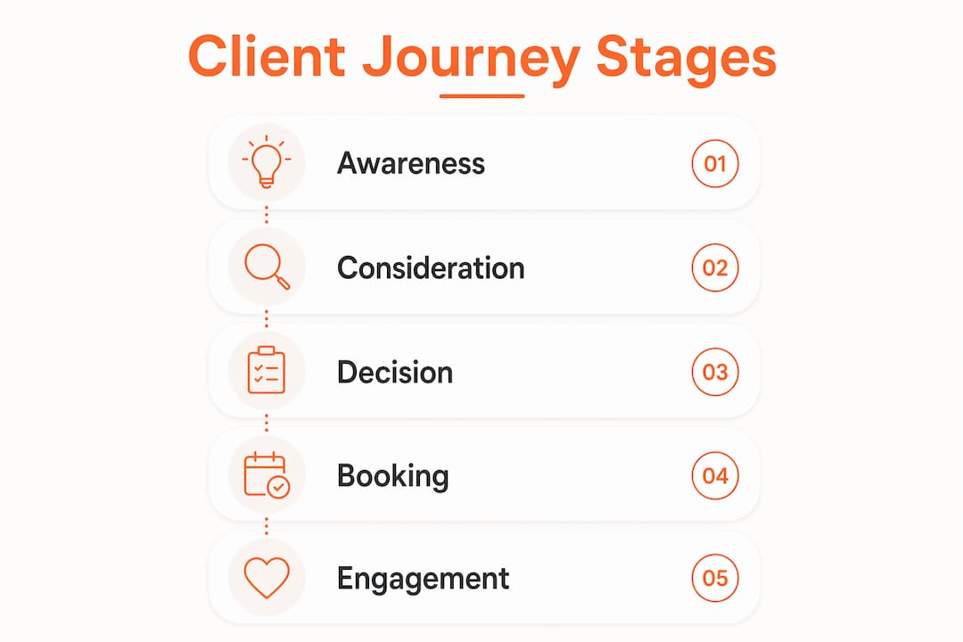
A coaching website that simplifies the client journey with a strong booking experience outperforms complex sites with confusing navigation. Simplicity is not a design preference. It is a revenue strategy.
Key Takeaways
Effective site architecture is the single most controllable factor in whether a coaching website attracts and converts clients or sits quietly collecting digital dust.
| Point | Details |
|---|---|
| Six-page core structure | Build Home, About, Services, Booking, Blog, and Privacy pages before adding anything else. |
| Three-click booking rule | Clients must reach your booking page within three clicks from any page on your site. |
| PageSpeed score of 80+ | A mobile PageSpeed score below 80 reduces search visibility and drives visitors away before they engage. |
| Integrated tools reduce drop-off | Connected booking, payment, and intake systems eliminate the friction that causes prospects to abandon the process. |
| One CTA per page | Each page should drive one specific action to focus visitor attention and increase completion rates. |
What I've learned from coaching websites that actually work
Here is the honest truth I've seen play out with coaches across every niche: the website that wins is rarely the prettiest one. It's the one that works like a well-run office. Every page knows its job. Every button leads somewhere useful. Every visitor feels like the site was built with their questions in mind.
I've worked with coaches who had gorgeous sites that generated zero inquiries. The problem was always structural. The booking link was three pages deep. The services page described the coach's process instead of the client's outcome. The navigation had eleven items and no clear starting point. Fixing those structural issues, before touching fonts or colors, produced results within weeks.
The mindset shift I encourage every coach to make is this: stop asking "Does my website look professional?" and start asking "Does my website process clients?" Those are two completely different questions, and only the second one grows your business. You can explore how your website functions as a business tool to see what that shift looks like in practice.
The coaches who invest in strategic site architecture, meaning structure first and aesthetics second, build websites that run like clockwork. They wake up to booked discovery calls, completed intake forms, and paid invoices, all without sending a single follow-up email. That is what a well-built coaching website actually delivers.
How Sierra Lin Design helps coaches build sites that convert
Sierra Lin Design builds custom Kajabi websites specifically for coaches and course creators who are done with cookie-cutter templates and tech headaches. Every project starts with your client flow, not your color palette.
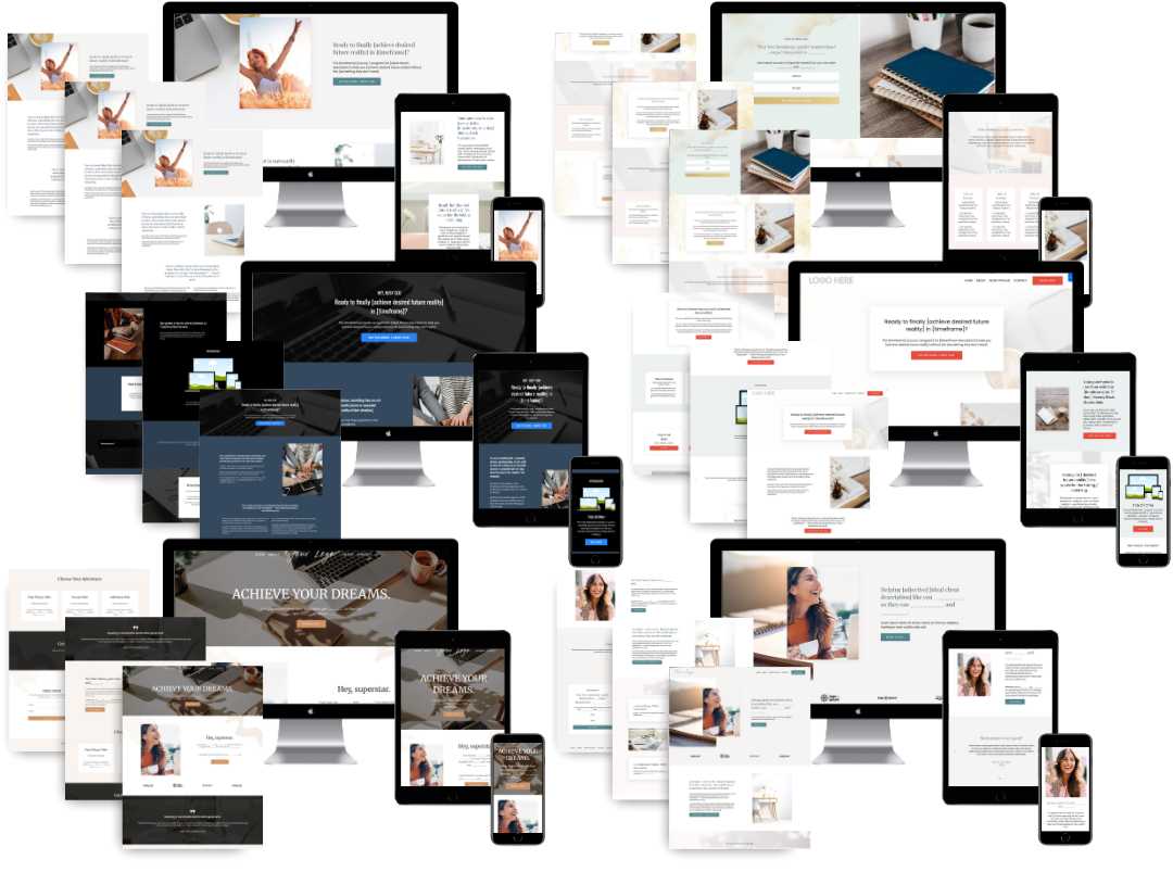
If you want to see what a structurally sound coaching site looks like before committing to a custom build, the free Kajabi templates are a solid starting point. For coaches ready to build a site that handles marketing, booking, and client onboarding inside one connected system, the custom Kajabi web design service covers everything from strategy to launch. Your website should be working for you around the clock, and Sierra Lin Design builds it to do exactly that.
FAQ
What is site architecture for a coaching website?
Site architecture is the organized structure of pages, navigation, and links that guides visitors through your website. For coaches, it determines how quickly a potential client can move from discovering your site to booking a session.
How many pages does a coaching website need?
A coaching website needs six core pages: Home, About, Services, Booking or Contact, Blog, and Privacy Policy. Each page serves a distinct role in attracting and converting clients.
Why does page load speed matter for coaching websites?
A Google PageSpeed mobile score below 80 reduces your site's search ranking and causes visitors to leave before engaging with your content. Faster sites rank higher and hold visitor attention longer.
How does booking integration improve client conversion?
Integrated booking systems connect scheduling, payment, and intake forms inside one workflow, eliminating the friction that causes prospects to drop off between interest and commitment.
What is the biggest architectural mistake coaches make?
The most common mistake is burying the booking or contact link more than three clicks from the homepage. Every extra click reduces the percentage of visitors who complete the booking process.
Recommended

🚨Get the FREE Checklist
Skip the Kajabi tears—Swipe the free Website Checklist & Funnel Map
Exactly what should go where on your Kajabi site to maximize leads.