Coaching Niche Website Examples That Convert Clients

The best coaching niche website examples share one defining trait: they function as client acquisition systems, not digital brochures.
A high-performing coaching site guides visitors from curiosity to booking through clear messaging, focused page structure, and conversion-oriented design. Platforms like Kajabi, Squarespace, and WordPress each support this goal differently, but the underlying principles stay the same. Whether you coach executives, health-seekers, or first-time entrepreneurs, your website either works for you around the clock or it quietly loses clients every day.
1. What are the must-have pages for a coaching niche website?
Coaching websites that convert follow a six-core page structure: Home, About, Services or Programs, Contact or Booking, Blog or Resources, and Privacy Policy. Each page has one job, and that job should be obvious to every visitor who lands on it.
Here is what each page must do:
- Home: Answer "Is this for me?" within the first 10 seconds. State who you serve, what outcome you deliver, and show one piece of proof.
- About: Build trust and connection. This page is not your resume. It is your "why I do this" story that makes you relatable.
- Services or Programs: Clarify your offer with a single primary CTA. Visitors should never have to guess what to do next.
- Contact or Booking: Use either a calendar booking link or an application form. Booking pages with both create overchoice and increase drop-off rates.
- Blog or Resources: Drive SEO traffic and demonstrate expertise. This page feeds your long-term visibility.
- Privacy Policy: Required for legal compliance and builds credibility with cautious visitors.
Pro Tip: Never place two competing CTAs with same priority on the same conversion page. "Book a call" and "Download my free guide" fight each other when presented as equal options. Pick one primary call to action per page and commit to it.
2. How top coaching websites build trust fast

Messaging clarity is the single biggest differentiator between coaching websites that convert and those that confuse. The 8-minute homepage rewrite method focuses on three elements above the fold: a clear who-plus-outcome line, one CTA, and one piece of social proof. That combination tells a visitor everything they need to decide whether to stay.
Social proof deserves its own strategy. Video testimonials outperform text because they carry tone, emotion, and credibility that a written quote cannot replicate. The most effective testimonials name a specific, measurable outcome. "I went from zero clients to a full roster in 90 days" beats "Sierra really helped me" every single time. Specific outcomes lower buyer anxiety and set clear expectations.
"A client-winning coaching website makes visitors feel seen and understood quickly, reducing overwhelm and confusion before they ever read a word about your offer."
Niche-specific branding also accelerates trust. A site built for executive coaching for women in tech communicates authority to that exact audience in a way a generic "life coaching" site never could. The more specific your positioning, the faster the right client self-selects.
Pro Tip: Rewrite your homepage headline using this formula: "I help [specific person] achieve [specific outcome] without [common frustration]." Test it against your current headline and watch your time-on-page numbers shift.
3. Types of coaching website designs and their strengths
There are five coaching website template types that match distinct business models. Choosing the wrong one creates friction between your offer and your visitor's experience.
| Template Type | Best For | Key Strength |
|---|---|---|
| 1:1 Coaching | Individual client work | Personal connection, application-focused flow |
| Group or Cohort Programs | Courses, masterminds | Community emphasis, enrollment urgency |
| Wellness or Therapy | Health, mindfulness coaches | Calm aesthetics, trust-first design |
| Consulting Style | Business or executive coaches | Authority positioning, case study integration |
| Personal Brand | Thought leaders, speakers | Story-driven, multi-offer flexibility |
Platform choice shapes what is possible within each template type. Kajabi suits coaches who want booking, course delivery, email marketing, and payments in one place. Squarespace works well for coaches prioritizing visual design with simpler tech needs. WordPress offers the most customization but demands more technical management.
2026 coaching website design trends include video-first storytelling on homepages, AI chatbots for visitor qualification, interactive quizzes that segment leads, and accessibility-first layouts. These elements do more than look current. They actively qualify visitors and move the right people toward booking. For a deeper look at what is working right now, the best practices for coaching web design covers these trends with specific implementation guidance.
4. Ways to differentiate your coaching website from competitors
Most coaching websites look the same because most coaches copy the same generic templates. Differentiation comes from specificity, not from flashier design.
Consistent CTA language across every page reduces decision fatigue and keeps visitors moving in one direction. If your homepage says "Book a Discovery Call," your services page should say the same thing. Changing the label at each step forces visitors to re-evaluate their decision, and many will not bother.
Operational integration separates a working website from a static one. Embedding booking, intake, payment, and reminders directly into your site makes it part of your coaching practice. Visitors book, pay, and receive onboarding materials without a single manual step from you. That experience signals professionalism before the first session begins.
Other differentiation strategies worth implementing:
- Niche-specific imagery: Stock photos of generic "success" visuals do not connect. Use photos that reflect your actual client's world.
- Outcome-specific copy: Replace "I help you reach your potential" with "I help burned-out marketing directors reclaim 10 hours a week."
- Interactive lead magnets: Quizzes, assessments, and free tools give visitors a reason to engage before they are ready to buy.
- Client journey transparency: Show visitors exactly what working with you looks like, step by step. Uncertainty kills conversions.
Pro Tip: Run page-level split tests on single elements like your headline, CTA button color, or hero image. Testing one variable at a time gives you clear data on what actually moves the needle.
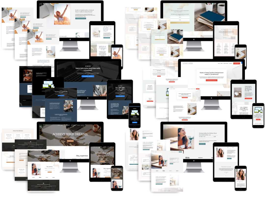
5. Coaching niche website examples that illustrate what works
The following examples represent diverse coaching niches and demonstrate the structural and design principles discussed above. Each one earns attention for a specific reason.
- Executive coach for women in tech: Clear niche positioning in the headline, a video testimonial above the fold, and a single "Apply Now" CTA. No distractions.
- Health and wellness coach: Calm color palette, a free quiz as the primary lead magnet, and a blog section that drives consistent SEO traffic.
- Business coach for solopreneurs: A consulting-style layout with case studies, revenue results from past clients, and a podcast integration that builds ongoing authority.
- Life coach for new mothers: Warm personal brand design, a story-driven About page, and a group program enrollment page with countdown urgency.
- Career coach for corporate professionals: A clean, minimal layout with a LinkedIn-style credibility section and a free resume audit as the entry-point offer.
- Relationship coach: Video-first homepage with a short "who this is for" explainer, outcome-specific testimonials, and a clear program comparison table.
- Mindset coach for athletes: High-energy visuals, sport-specific language throughout, and a booking page that uses a short application form to qualify leads.
- Financial coach: Authority-first design with media mentions, a free budgeting tool, and a services page that separates 1:1 from group offers with distinct CTAs.
For more inspiration across these niches, the life coach website examples collection and the health coach website examples roundup both show real sites with detailed breakdowns of what makes each one work. Curated collections of 30-plus coaching websites across life, dating, career, health, and business coaching also provide broad inspiration for coaches at any stage.
Key takeaways
A coaching website converts clients when it combines a clear six-page structure, specific niche messaging, and integrated operational workflows into one focused client acquisition system.
| Point | Details |
|---|---|
| Six-page structure is non-negotiable | Home, About, Services, Booking, Blog, and Privacy Policy each serve a distinct conversion role. |
| One CTA per page drives action | Competing calls to action fragment decisions and increase drop-off rates across key pages. |
| Video testimonials build faster trust | Outcome-specific video proof lowers buyer anxiety more effectively than text quotes alone. |
| Template type must match your business model | Choosing between 1:1, group, wellness, consulting, or personal brand templates affects every design decision. |
| Operational integration separates great sites | Embedding booking, intake, and payment into your site makes it a working practice tool, not just a page. |
What I've learned from studying hundreds of coaching sites
Here is the uncomfortable truth I share with every coach I work with: most coaching websites fail not because of bad design but because of unclear thinking. The coach knows exactly what they do. The visitor has no idea. That gap costs clients every single day.
The coaches whose sites actually work have done the hard thinking first. They know their niche cold. They can say in one sentence who they help and what changes for that person. Everything else, the colors, the fonts, the layout, flows from that clarity. When I build a Kajabi site for a client, the first conversation is never about design. It is always about positioning.
I also see coaches over-invest in visual complexity and under-invest in conversion structure. A beautiful site with five CTAs and no clear next step will always lose to a simpler site with one focused path. The role your website plays in your overall business model matters more than any design trend.
Start with the six core pages. Get your messaging tight above the fold. Add one piece of strong social proof. Then test, adjust, and build from there. That sequence works. Every time.
Ready to build a coaching website that actually works?
If you have been inspired by these coaching niche website examples and want to stop guessing at what works, Sierra Lin Design builds custom Kajabi websites designed specifically for coaches and course creators. Every site includes a conversion-focused page structure, integrated client flows, and a design that reflects your specific niche and brand. No cookie-cutter templates. No tech headaches.
Just a site that runs like clockwork from day one.
Explore the custom Kajabi web design services built for coaches, or browse the Sierra Lin Design portfolio to see real examples of what is possible for your coaching brand.
FAQ
What pages does every coaching website need?
Every coaching website needs six core pages: Home, About, Services or Programs, Contact or Booking, Blog or Resources, and Privacy Policy. Each page serves a specific role in guiding visitors toward becoming clients.
How many CTAs should a coaching website have per page?
Each page should have one primary CTA. Multiple competing CTAs increase visitor confusion and reduce conversion rates across key pages like Services and Booking.
What makes a coaching website stand out from competitors?
Niche-specific messaging, outcome-focused testimonials, and integrated booking and payment systems differentiate a coaching site. Generic positioning and stock visuals are the most common reasons coaching websites fail to convert.
Which platform is best for a coaching website?
Kajabi is the strongest choice for coaches who want course delivery, email marketing, booking, and payments in one place. Squarespace suits coaches who prioritize design simplicity, while WordPress offers the most flexibility for those with technical resources.
How do i know if my coaching website is converting well?
Track time on page, bounce rate, and booking form completions. Running single-variable split tests on headlines and CTAs gives you clear data on what changes actually improve results.
Recommended
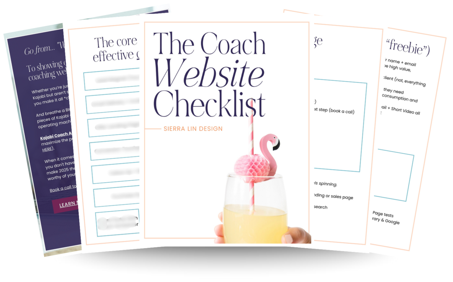
🚨Get the FREE Checklist
Skip the Kajabi tears—Swipe the free Coach Website Checklist & Funnel Map
Exactly what should go where on your Kajabi site to maximize coaching leads.