Coaching Website Conversion Mistakes Coaches Must Fix

Coaching website conversion mistakes are errors in your site's structure, messaging, or flow that stop visitors from becoming paying clients. Most coaches assume a low-converting site means a weak offer. The real culprit is almost always a missing structural element. According to the 2026 Communipass benchmark, conversion gaps are rarely about offer quality. They come from missing levers like delivery clarity, booking flow alignment, and trust signals. Fix those, and your site starts working the way it should.
1. What is the biggest coaching website conversion mistake?
The single most damaging coaching site conversion error is leaving out delivery and fulfillment details. Visitors land on your sales page, feel interested, and then hit a wall. They cannot picture what happens after they pay. That uncertainty kills the sale.

The 2026 Communipass benchmark shows that pages missing three or four of the five key conversion levers convert below 10%. The delivery section is the most frequently missing lever of all. That means coaches are losing clients not because of price or positioning, but because they never answered the question every buyer silently asks: "What exactly do I get and how does it work?"
A strong delivery section answers that question in plain language. It tells clients:
- How sessions are delivered (video call, phone, in-person)
- How often you meet and for how long
- What they receive between sessions (voice notes, worksheets, Voxer access)
- How they book their first session after signing up
- What the onboarding process looks like
This section acts as an objection-killer on your page. It removes the hidden friction that stops buyers from clicking the button. Write it in warm, client-facing language, not a bullet list of logistics.
Pro Tip: Rename your delivery section something like "Here's how we work together" instead of "Program Details." That framing feels personal and reduces buyer anxiety before they even read a word.
2. How does a misaligned booking flow damage conversions?
Your booking flow is the bridge between interest and commitment. When it does not match how your buyer makes decisions, they drop off. High-ticket buyers expect a human conversation before paying. Sending them straight to a payment page skips the trust-building step they need.
Form friction is the other major issue. Research from SKDUL's booking psychology study shows that reducing form fields from six to three can improve conversion by 30–50%. Every extra required field reduces booking conversion by approximately 5–10%. That is a significant drop for something as simple as removing a field asking for a phone number.
Time slot overload also hurts. Booking pages converting at 40–60% use recommended time slots with minimal visible choices. Showing 40 open slots creates decision fatigue. Showing three curated options with a "recommended" label moves people forward.
Here is what a well-optimized booking flow looks like:
- Ask for name and email only at the first step
- Offer three to five curated time slots, not an open calendar
- Use a CTA that matches the next human step, not a transaction
- Confirm the booking with a warm, personal message
- Follow up automatically with a reminder and prep instructions
Pro Tip: Replace "Book a Session" with "Have a chat to see if we're a fit." That single copy change reduces the perceived commitment and increases click-through on discovery calls.
3. Why treating your website as a brochure kills conversions
A brochure tells people what you do. A client-getting website moves people through a complete journey from curiosity to booked call to paid client. Most coaching websites stop at the brochure stage. They describe the offer but do not guide the visitor through the next step, and the step after that.
Fragmented tools increase admin and anxiety for clients and lower conversions. When your booking tool lives on one platform, your intake form on another, your payment processor on a third, and your onboarding emails somewhere else entirely, the experience feels disjointed. Clients notice. That friction signals disorganization, and disorganization erodes trust.
The fix is integration. A coaching website that embeds the full client journey within a single platform reduces anxiety and admin burden for both you and your clients. Platforms like Kajabi allow you to connect booking, intake, payment, and onboarding into one continuous flow. Tools like ClickCoach also offer integrated scheduling, payment, and onboarding in one login.
Practical steps to unify your client journey:
- Connect your discovery call booking directly to an intake form
- Trigger a welcome email automatically after booking confirmation
- Link payment to immediate course or resource access
- Send onboarding instructions without manual follow-up
- Keep all client communication within one platform where possible
When the experience runs like clockwork, clients feel confident they are in good hands before the first session even starts.
4. Common messaging mistakes that push visitors away
Visitors must understand who you help and what problem you solve within the first few seconds of landing on your site. If your homepage headline leads with your credentials, your methodology, or your certification, you have already lost most visitors. People do not buy your process. They buy the outcome they want.
The most common messaging errors on coaching websites include:
- Leading with modality lists ("I use NLP, somatic work, and CBT") instead of outcomes
- Using jargon that means nothing to a cold visitor ("I help you step into your power")
- Burying the client benefit below the fold
- Writing about yourself before addressing the visitor's problem
- Skipping emotional connection and jumping straight to credentials
Social proof is the other major gap. Adding testimonials and guarantees can increase conversion rates 1.3–2x. Specific guarantees outperform vague ones. "You will have a clear 90-day plan by the end of session one" converts better than "I guarantee results."
Pro Tip: Place your strongest client testimonial directly below your hero section, not at the bottom of the page. Visitors who see social proof early stay longer and convert at a higher rate.
Your messaging should answer three questions in the first screen: Who is this for? What will change for them? Why should they trust you? Get those three right, and the rest of the page does its job.
5. How to fix navigation and design mistakes that reduce bookings
Multiple CTAs and navigation paths on one page cause visitors to freeze. When someone can click on your blog, your about page, your podcast, your Instagram, and your booking link all from the homepage, they often click nothing. Decision fatigue is real, and it costs you clients.
High-converting coaching websites guide visitors through a clear, linear path rather than offering every option at once. The homepage has one primary CTA. The services page leads to one booking action. Each page serves one purpose.
Mobile design is equally critical. Mobile-friendly layout, button size, and form readability directly affect how professional your site feels and how easy it is to take action. A button that is too small to tap, a form that requires horizontal scrolling, or text that forces pinching and zooming all signal a site that was not built with the client in mind.
| Design mistake | Better approach |
|---|---|
| Five CTAs on the homepage | One primary CTA above the fold |
| Open navigation with 8+ links | Simplified nav with three to four core pages |
| Small tap targets on mobile | Buttons at least 44px tall for easy tapping |
| Long booking forms | Three fields maximum at the first step |
| Generic button text ("Submit") | Specific button text ("Book your free call") |
Consistent button labels also build trust. If your CTA says "Book a call" on the homepage and "Schedule a consultation" on the services page, visitors wonder if they are clicking the same thing. Pick one phrase and use it everywhere.
Key takeaways
Coaching website conversion mistakes are structural, not cosmetic. Fixing delivery clarity, booking flow, integration, messaging, and navigation design are the five highest-impact changes you can make to increase client bookings.
| Point | Details |
|---|---|
| Add a delivery section | Explain exactly what happens after payment to remove buyer uncertainty. |
| Simplify your booking form | Reduce fields to three and limit visible time slots to cut drop-off. |
| Integrate your client journey | Connect booking, intake, payment, and onboarding in one platform flow. |
| Lead with outcomes, not methods | Answer who you help and what changes for them within the first screen. |
| Use one CTA per page | Remove competing links and navigation options that create decision fatigue. |
What I've learned from building Kajabi coaching sites that actually convert
Here is the uncomfortable truth I see over and over: most coaches have a strong offer and a weak website. The offer is clear in their head. It just never made it onto the page in a way visitors can feel.
The mistake I see most often is not any single missing element. It is the assumption that a beautiful site equals a converting site. I have audited gorgeous websites that booked zero discovery calls because the booking button was buried, the delivery details were missing, and the homepage headline was about the coach's philosophy instead of the client's problem. Aesthetics matter for credibility. Structure drives conversion.
The fix is not always a full redesign. Sometimes it is rewriting the hero headline, adding a delivery section, and changing one CTA. Start with the website elements that drive conversions before touching the visual design. Data tells you what to fix. Assumptions keep you redesigning the same broken site in a prettier color palette.
My honest advice: audit your site against the five levers (delivery, booking flow, integration, messaging, and navigation) before spending money on ads or SEO. Traffic to a broken site just accelerates your losses.
How Sierra Lin Design helps coaches fix these conversion gaps
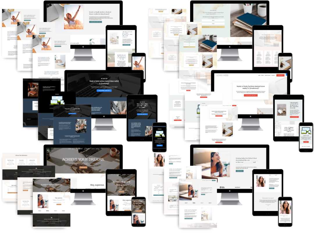
If you have read through this list and recognized your own site in more than two or three of these mistakes, a custom Kajabi build might be the fastest path forward. Sierra Lin Design creates custom Kajabi websites that integrate booking, intake, payment, and onboarding into one clean client flow. No more patching together five different tools and hoping they talk to each other.
Every site Sierra Lin Design builds is structured around conversion from the start, with clear CTAs, delivery sections, and mobile-ready design built in. If you want to see what that looks like in practice, browse the Kajabi design portfolio or grab the free Kajabi templates to get started right now.
FAQ
What is a coaching website conversion mistake?
A coaching website conversion mistake is any structural, messaging, or design error that stops a visitor from booking a call or buying a program. Common examples include missing delivery details, long booking forms, and unclear homepage headlines.
Why is my coaching website not getting bookings?
The most common causes are a missing delivery section, a booking flow that does not match how high-ticket buyers make decisions, and a homepage that leads with your credentials instead of the client's outcome. Fixing these three areas typically produces the fastest improvement.
How many form fields should a coaching booking page have?
Three fields or fewer at the first step. Research shows that reducing form fields from six to three can improve booking conversion by 30–50%, and each extra required field reduces conversion by approximately 5–10%.
Does social proof really affect coaching website conversions?
Yes. Adding specific testimonials and guarantees can increase conversion rates 1.3–2x. Specific guarantees, such as a clear outcome by a defined session, outperform vague promises.
What platform works best for a high-converting coaching website?
Kajabi is the strongest all-in-one option for coaches because it connects booking, course delivery, email automation, and payment in one platform. That integration removes the fragmented tool problem that lowers conversions on most coaching sites.
Recommended
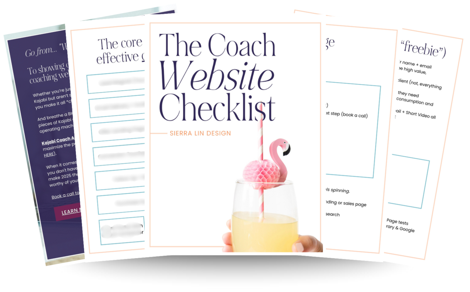
🚨Get the FREE Checklist
Skip the Kajabi tears—Swipe the free Coach Website Checklist & Funnel Map
Exactly what should go where on your Kajabi site to maximize coaching leads.