Why Your Coaching Niche Affects Site Design

Your coaching niche is the single most powerful force shaping your website's design, messaging, and conversion strategy. Niche alignment, the practice of building every site element around a specific client type and outcome, determines whether visitors stay or leave within seconds. Coaches who treat their site as a general portfolio lose clients to coaches who speak directly to one person's exact problem. Understanding why coaching niche affects site design is the difference between a site that sits quietly in a corner and one that books calls while you sleep.
Why niche clarity is essential for effective coaching website design
A clear niche statement is the foundation of every design decision on your site. Coaching websites must state the niche within five seconds of landing to keep visitors from bouncing. Five seconds is not much time. Every word in your headline, every image above the fold, and every color choice either confirms or confuses that message.
Niche clarity also sharpens your copy in ways that generic coaching language never can. When you specialize, you write to one person's specific pain point instead of a vague audience. A career coach targeting burned-out corporate attorneys writes very differently than a life coach targeting "anyone who wants more." The first site converts. The second one collects traffic that goes nowhere.

Specialization helps coaches craft precise messages that convert better and command premium pricing because they reduce the client's perceived risk. That is a critical insight. When a prospect reads your site and thinks "this is exactly my situation," their sales resistance drops before they ever book a call.
Niche-focused websites also build trust faster through targeted content sections. These include:
- A client avatar description that mirrors the visitor's current reality
- A signature offer built around one specific transformation
- Testimonials from clients in the same life stage or industry
- A credentials section that highlights relevant certifications, not every award you have ever earned
- An FAQ that addresses the exact objections your niche raises
Pro Tip: Limit your navigation menu to five items or fewer. Every extra link pulls attention away from your primary conversion path and signals that your site is for everyone, which means it speaks to no one.
About 73% of prospective coaching clients look for credentials like ICF certification as baseline trust signals. That number tells you credentials are not optional. They are table stakes for your niche audience, and they belong in a visible, prominent location on your site.
How does coaching niche influence layout and site structure?
Your niche determines the entire skeleton of your site, not just the colors and fonts. A wellness coach serving postpartum mothers needs a warm, calm layout with soft imagery and a clear path to a free resource. A leadership coach serving Fortune 500 executives needs a clean, authoritative structure with social proof from recognizable companies. The same Kajabi template styled differently for each niche produces completely different results.
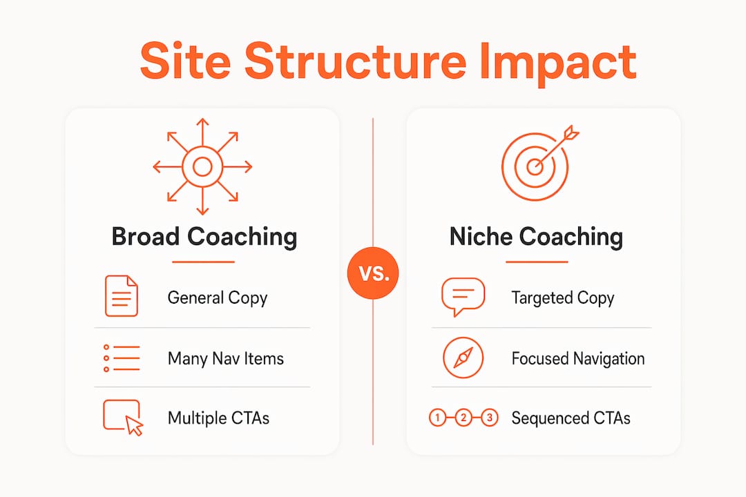
Minimalist design using negative space reduces cognitive load for buyers and strengthens conversion versus content sprawl. Negative space is not empty space. It is breathing room that guides the eye toward your most important message and your call to action. Coaches who pile every service, every blog post, and every certification onto the homepage create decision fatigue before a prospect even reads the offer.
Focused navigation menus are a direct product of niche clarity. When you know exactly who you serve, you know exactly what pages they need. A health coach might need: Home, Work With Me, About, and Book a Call. A course creator coach might add a Courses page. Neither site needs eight navigation items pulling visitors in different directions.
| Site element | Broad coaching site | Niche-driven coaching site |
|---|---|---|
| Homepage headline | "Helping you live your best life" | "Career clarity for burned-out corporate lawyers" |
| Navigation items | 8–10 links | 4–5 focused links |
| CTA placement | Multiple CTAs above the fold | Single CTA after trust content |
| Testimonials | General praise | Outcome-specific, niche-matched results |
| Imagery | Stock photos of sunsets | Client-type-specific, relatable visuals |
What design elements reflect niche-specific client expectations?
Every coaching niche carries a set of unspoken expectations that your site either meets or misses. A prospect landing on a mental wellness coach's site expects calm colors, empathetic language, and a gentle path forward. A prospect landing on a business growth coach's site expects bold results, clear ROI language, and fast access to a booking link. Getting this wrong costs you the client before they read a single word of your offer.
Certifications are a non-negotiable trust signal in most coaching niches. ICF certification and similar credentials function as baseline trust signals for the majority of coaching prospects. Display them prominently on your homepage and About page, not buried in a footer. For health and wellness coaches, additional certifications from recognized bodies like the National Board for Health and Wellness Coaching carry the same weight.
Testimonials work hardest when they include measurable outcomes tied to your niche. "Sierra helped me feel more confident" is weak. "I landed a $180,000 in-house counsel role six weeks after working with Sierra" is a conversion tool. Your niche determines what outcomes matter to your audience, and your testimonials should speak that language directly.
Discovery call booking links are a structural design element, not just a button. Websites with a prominent, direct booking link for a discovery call convert at around 25% among high-intent prospects, outperforming general contact forms. That gap is significant. A contact form asks the visitor to wait. A booking link gives them control and momentum.
Other niche-specific design elements that shift conversion include:
- Imagery that reflects your actual client type, not generic stock photos
- Color palettes that match the emotional tone of your niche (earthy tones for wellness, navy and white for corporate leadership)
- Copy that names the client's job title, life stage, or specific struggle in the first sentence
- Video introductions that let prospects hear your voice and assess your energy before booking
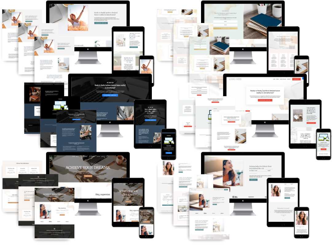
You can see how these elements come together by reviewing niche-focused site examples from coaches who have built sites around a specific audience.
Practical steps to align your website design with your niche
Aligning your site with your niche is a process, not a one-time task. Start with these steps:
-
Define your niche with a job title or life stage. Vague niches produce vague sites. Specializing your content around a clearly named niche job title or life stage helps clients identify their problems and envision success. "Coaches" is not a niche. "First-generation female executives navigating corporate politics" is a niche.
-
Audit your current homepage headline. Read it out loud and ask: does this describe one specific person's problem? If it could apply to any coach's site, rewrite it. Your headline is the first design decision on your page.
-
Map your client's trust journey. List every question your ideal client asks before booking a call. Then check whether your site answers those questions in the right order. This is your content sequence, and it drives your layout decisions. Mapping your funnel before you design saves hours of revision later.
-
Integrate a direct booking system. Tools like ClickCoach connect booking, client management, and follow-up in one place. A booking link that works smoothly is a design element. A broken or confusing booking flow kills conversion regardless of how good the rest of your site looks.
-
Update your site quarterly. Your niche understanding deepens over time. New client results, updated certifications, and refined messaging should flow back into your site on a regular schedule. A site that reflects who you served two years ago does not convert the clients you want today.
-
Check your site against best practices for coaching websites to identify gaps between your current design and what your niche actually needs.
Micro-niches enable coaches to create signature offers faster and reduce the length of the sales cycle. The tighter your niche, the faster a prospect decides you are the right fit. That speed shows up in your conversion rate.
My honest take on niche-first design
I have worked with coaches at every stage, from brand-new practitioners to six-figure course creators, and the pattern is consistent. The coaches with the most beautiful sites are not always the ones booking the most clients. The coaches with the clearest niche statements are.
Most coaching websites fail because they try to be a trophy case of awards rather than a home for the ideal client. I see this constantly. A coach spends months collecting logos, certifications, and press features, then arranges them on a homepage that tells the visitor nothing about whether this coach can solve their specific problem.
The sites I build at Sierra Lin Design always start with the niche, not the color palette. Once we know exactly who the site is for, every other decision gets easier. The headline writes itself. The layout sequence becomes obvious. The CTA placement stops being a guess.
Niche clarity also solves the pricing problem that most coaches avoid talking about. Niche specificity anchors pricing by articulating the high cost of inaction for the client. When your site speaks directly to a $200,000-a-year executive who is miserable in her role, she does not flinch at a $5,000 coaching package. She flinches at the idea of staying stuck for another year. Your niche-driven site makes that cost of inaction visible, and that is what closes the sale.
Your website is not a brochure. It is a client home. Design it for the person you actually want to serve.
Custom Kajabi design built around your coaching niche
If your site is not reflecting your niche clearly, the problem is rarely the platform. It is the strategy behind the design. At Sierra Lin Design, every custom Kajabi website starts with your niche, your client avatar, and your conversion goals before a single page gets built. The result is a site that speaks directly to your ideal client and guides them toward booking without confusion or friction. Whether you are starting fresh or redesigning an existing site, you can work with Sierra Lin Design on a custom build tailored to your niche.
Prefer to start with a foundation? Free Kajabi templates are also available to help you get your niche-aligned site off the ground faster.
FAQ
Why does a coaching niche affect website design so much?
Your niche defines your audience's expectations, emotional triggers, and trust signals. Every design decision, from layout to color to copy, must match what that specific audience needs to feel confident booking with you.
How quickly should my niche be clear on my coaching website?
Visitors must understand your niche within five seconds of landing on your site. If your homepage headline does not name who you serve and what you help them achieve, most visitors will leave before reading further.
What design elements differ most between coaching niches?
Color palettes, imagery, CTA placement, and testimonial framing all shift significantly by niche. A wellness coach and a corporate leadership coach serve different emotional states and require completely different visual and structural approaches.
Does a tighter niche really improve conversion rates?
Yes. Micro-niche coaching reduces the sales cycle length and improves marketing clarity because prospects self-identify faster. A visitor who sees their exact situation described on your site converts at a much higher rate than one who has to guess whether you are the right fit.
Should I use a booking link or a contact form on my coaching site?
Use a direct booking link. Discovery call booking links significantly outperforming general contact forms, which create friction and delay.
Key takeaways
Your coaching niche drives every design decision on your website, from the headline to the CTA sequence to the color palette, and ignoring that connection costs you clients.
| Point | Details |
|---|---|
| Niche clarity within five seconds | Your homepage headline must name who you serve and what you help them achieve before visitors bounce. |
| CTA placement follows trust | Place your "Book a Call" button after credentials, story, and testimonials, not above the fold. |
| Credentials are non-negotiable | Display ICF or relevant certifications prominently, as most prospects use them as baseline trust signals. |
| Minimalist layout converts better | Negative space and focused navigation reduce cognitive load and guide visitors toward your offer. |
| Booking links outperform contact forms | A direct discovery call link converts high-intent prospects at a significantly higher rate than a generic form. |
Recommended
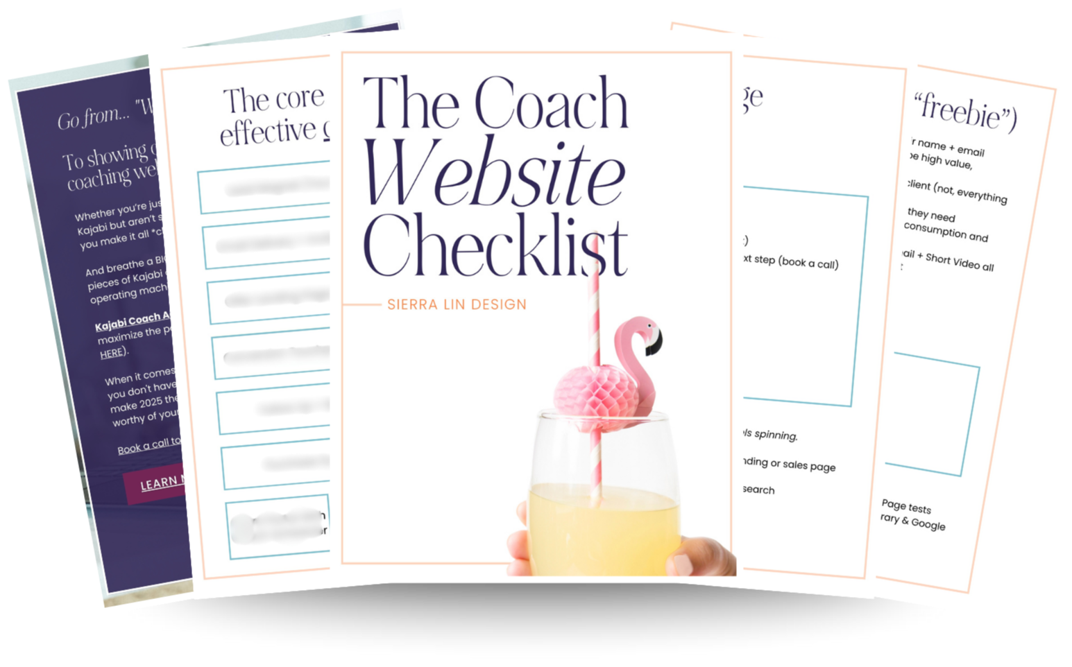
🚨Get the FREE Checklist
Skip the Kajabi tears—Swipe the free Coach Website Checklist & Funnel Map
Exactly what should go where on your Kajabi site to maximize coaching leads.