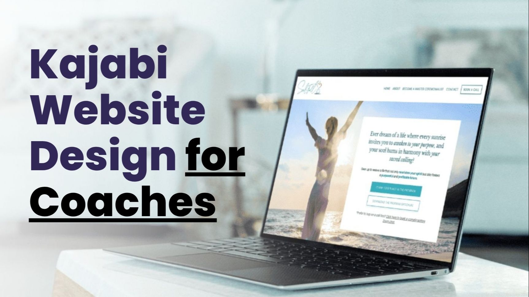
Kajabi Website Design for Coaches: Building Digital Presence That Actually Works
I've seen it happen a hundred times. A coach reaches out to me, frustrated and confused. Their website looks fine, they think. The colors match. The logo is clean. But nobody buys. Nobody books calls. The phone stays silent. That gnawing feeling creeps in. Is my coaching bad? Do I not know enough? Maybe I should quit.
Stop right there. Your coaching might be brilliant. Your expertise might be life-changing. But if your Kajabi website design for coaches misses the mark, none of that matters. People judge books by covers. They judge coaches by websites. It's harsh. It's unfair. It's reality.
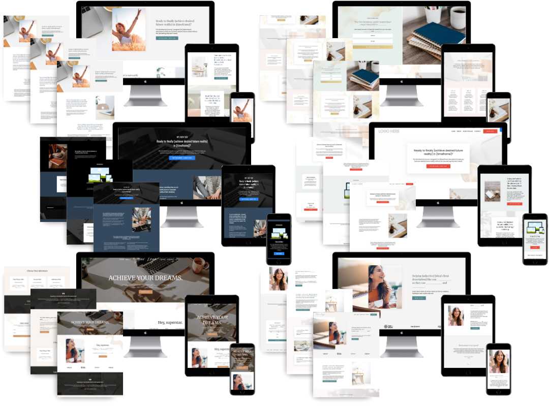
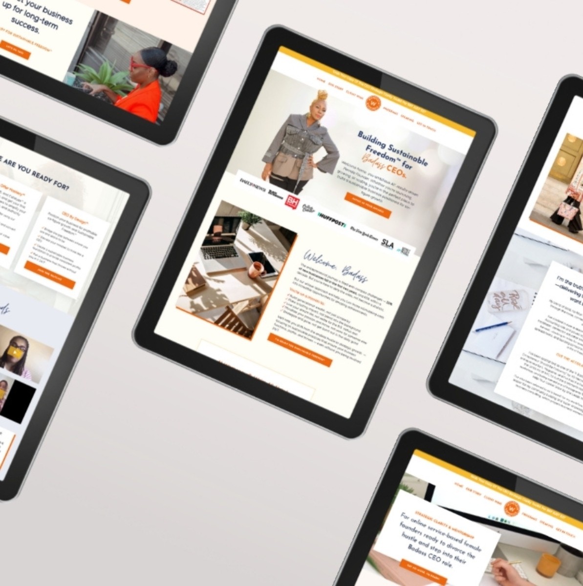
I design Kajabi wesbites for a living. I've launched hundreds of effective coaching websites. Life coaches, business coaches, health coaches, spiritual coaches, executive coaches. The ones who succeed don't have bigger audiences. They have better websites. They understand that design isn't decoration. Design is conversation.
Let me walk you through what I've learned so you can implement what actually works (and skip the rest!).
Why Coaching Websites Fail (And It's Not What You Think)
Here's the uncomfortable truth most coaches won't tell you. Your website isn't failing because your niche is too broad. It's not failing because you haven't done enough Instagram lives. It's failing because your site feels like a brochure from 2003.
I remember consulting a coach with years of experience. She'd helped hundreds of people land dream jobs. Yet her website design was pure diy html. We were talking because she was getting turned down for speaking events for consultants who had less experience.
The problem was simple. Her design (and, therefore, her brand) screamed amateur. Her content whispered generic. There was no connection, no emotion, no reason to stay.
Kajabi website design for coaches solves this specific pain point. Kajabi gives you a great set of tools for coaching. But tools don't create magic.
That's where strategy comes in!
Let me break down the common failure modes I've observed:
- The Vanity Site: Looks beautiful. Won awards, maybe. But nobody converts because there's no clear pathway to buying.
- The Dump Truck: Everything goes on the homepage. Services, testimonials, blog posts, podcast episodes, speaking reels, a section about your cat. Overwhelming. Confusing. Deadly.
- The Vague Philosopher: "I help people transform." Transform into what? A butterfly? A CEO? A happier human? Be specific or be ignored.
I've seen every single one of these mistakes. (Once, a site with seventeen menu items. Seventeen!! People couldn't find the "buy now" button because it was buried under "resources" → "tools" → "recommended reading" → "how to work with me." 🫨)
The Emotional Architecture of a Coaching Website
Let me tell you something most Kajabi experts won't:
Your website is not about you. It's not about your credentials. It's not about your methodology or your certifications or that fancy degree.
Your website is about the person scrolling on their phone at 2 AM. They're anxious. They're stuck. They're searching for answers they can't name. They don't care about your bio.
They care about whether you understand their pain.
This is where Kajabi website design for coaches becomes a psychological game. Every element on your site either builds trust or erodes it. There's no neutral ground.
Think about the last time you visited a website and immediately felt safe. What did it have? Clean typography? Warm colors? A face that looked genuinely kind? These aren't aesthetic choices. They're emotional signals.
I tell my clients: design for the feeling, not the feature. Don't start with "I need a testimonials section." Start with "I want visitors to feel like they've found their person." Then build backward from that emotion.
Have you ever noticed how emergency room waiting areas are designed? They're deliberately calming. Soft colors, muted sounds, gentle lighting. Because sick people are scared. Coaching websites should work the same way. Your ideal clients are scared. They're overwhelmed. They're desperate for someone who gets it.
Your design should whisper: "I see you. I understand. You're in the right place."
Breaking Down the Homepage: Every Element Matters
Your homepage is your digital front door. It's also your most wasted real estate. I've audited hundreds of coaching sites. Most of them lead with something useless like "Welcome to my site" or "Thanks for stopping by."
Let me be blunt. Nobody cares about being welcomed. They care about whether you can solve their problem.
Here's what I've found actually works:
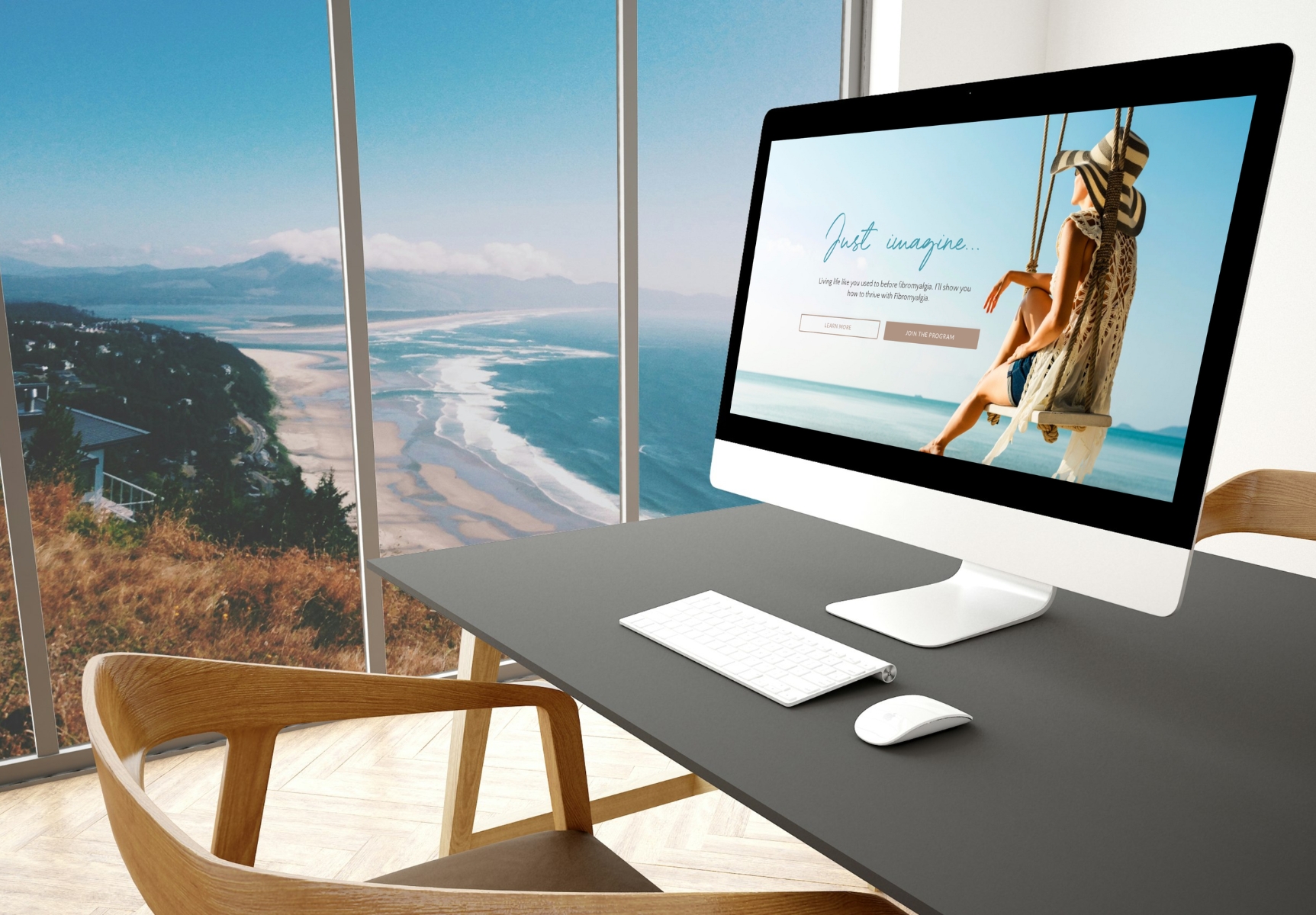
The Headline That Cuts
Your headline needs to do one thing. Make someone stop scrolling. That's it. Not explain your philosophy. Not showcase your credentials. Stop. The. Scroll.
Bleh headline: "Helping couples communicate better."
Better headline: "Stop fighting about the dishes. Start feeling connected again."
Why? Because specific pain beats generic benefit every single time. "Fighting about the dishes" is visceral. It's real. It's happening in thousands of homes right now. Couples read that and think "That's us. That's exactly us."
Your Kajabi website design for coaches needs this same specificity. If you're a business coach, don't say "I help entrepreneurs grow." Say "I help freelancers stop living paycheck to paycheck." If you're a health coach, don't say "I promote wellness." Say "I help busy moms lose the baby weight without giving up pizza."
Rules for killer headlines:
- Use pain words (stuck, frustrated, overwhelmed, exhausted)
- Name the specific transformation
- Make it feel like mind-reading
- Keep it under about twelve words
- Test three versions and track which one converts
The Subheadline That Completes
Your headline hooks them. Your subheadline reels them in. This is where you explain the mechanism, not just the result.
Bad subheadline: "I use evidence-based coaching methods."
Good subheadline: "A simple 12-week system that helps you finally break the cycle of emotional eating."
Notice the difference? The good subheadline gives them a mental model. It's simple. It's clear. It sounds achievable. They can picture themselves succeeding.
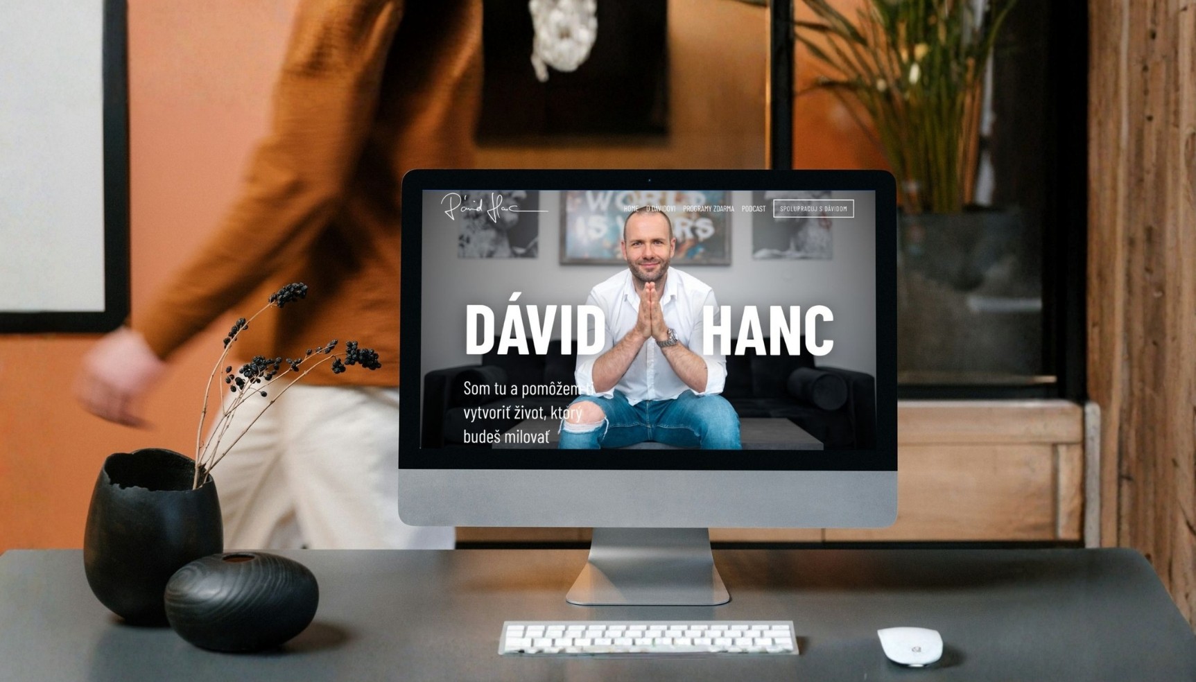
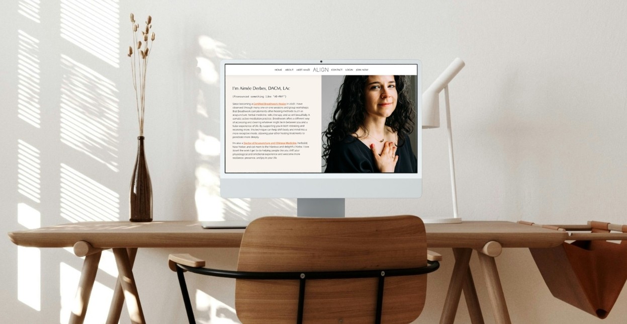
The Image That Connects
This one drives me crazy. So many coaches use stock photos of strangers laughing at salad or staring thoughtfully at laptops. Your visitors aren't dumb. They know these aren't real clients. It feels fake. Fake destroys trust.
Use your own face. Use your real smile. Use images of you working with actual clients (with permission, obviously). If you don't have professional photos, take selfies in good lighting. Seriously. Authenticity beats production value every time.
Your Kajabi website design for coaches should feel like a conversation, not a commercial.
The Navigation Nightmare: Less Is More
Let me ask you something. How many menu items does your website have right now? Go check. I'll wait.
If it's more than six, you have a problem. I don't care how important every single page seems. Humans have limited attention. Every menu option is a distraction. Every distraction reduces conversions.
I worked with a coach who had nine menu items. Nine. Her services page had sub-menus. Her blog had category pages. Her about page had three different sections with internal anchors. Visitors were lost. They couldn't find anything. They left.
Cut your menu items to increase clarity and, through clarity, conversions.
The brutal truth: Your website navigation is not a filing cabinet. It's not supposed to categorize every piece of information you've ever produced. It's supposed to guide visitors toward one specific action.
That action depends on your offer structure:
- If you sell courses, your navigation should lead to the enrollment page
- If you do one-on-one coaching, your navigation should lead to the booking page
- If you have a membership, your navigation should lead to the join page
Everything else is noise. Move it to the footer. Put it in your blog sidebar. But don't let it compete with your primary conversion goal.
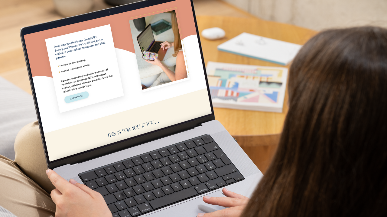
Sales Pages That Actually Sell
Here's where most coaches fall apart. You built a beautiful homepage. You have a freebie that's getting downloads. People are interested. Then they click through to your sales page and... nothing. No purchase. No curiosity. No response.
Your sales page is the engine of your business. If it's broken, nothing else matters.
Kajabi website design for coaches gives you the framework. But I've seen a thousand sales pages that look technically perfect and convert nobody. Because design isn't just about how it looks. It's about how it feels.
The Structure I Use
I've tested many different sales page structures. This is a great one to start with for your first (or next) sales page:
Section 1: The Painful Hook
Above the fold, your headline should name the pain so specifically it hurts. Your subheadline should promise relief. No fluff. No warm-up. Just "You're struggling with X. Here's how to fix it."
Section 2: The Empathy Bridge
Now you show them you understand. Describe their situation in vivid detail. Use their words. If they say "I feel stuck," write "You feel stuck." Mirror their language. This builds instant rapport.
Section 3: The Story
This is where you share your transformation. Not your bio. Your story of how you went from where they are to where they want to be. Keep it personal. Keep it raw. Vulnerability sells.
Section 4: The Solution
Introduce your offer. But don't just list features. "Module 1 covers goal setting" is boring. "Module 1 helps you finally figure out what you actually want" is compelling.
Section 5: The Proof
Testimonials, case studies, before-and-after stories. Video is best. Written with a photo is good. Anonymous quotes with no proof? Useless.
Section 6: The Objections
Answer their doubts before they have them. "I don't have time." "I can't afford it." "I've tried everything." Address each one directly.
Section 7: The Risk Reversal
Your guarantee. Make it strong. "If you don't see results in 30 days, I'll refund every penny and give you a bonus." Confidence sells.
Section 8: The Final Push
One last CTA. Clear. Bold. No options. Just "Join Now" or "Book Your Call."
What Most Coaches Get Wrong
They bury their testimonials at the bottom. Test with testimonials right after your solution section. Watch what happens.
They write long paragraphs. Nobody reads paragraphs on a sales page. Not even your mom. Break everything into short sentences. Use bullet points. Use bold text. Make it scannable.
They hide the price. I've had coaches tell me "I don't want to scare people away." Then build more value before showing the price. But show it eventually. Hidden pricing feels sketchy.
They use fake urgency. "Only 3 spots left!" When really there are 30. People can smell dishonesty. Real scarcity is fine. Fake scarcity destroys reputation.
The Color and Font Psychology
You might think this is superficial. It's not. Colors evoke emotions. Fonts communicate personality. If you ignore this, you're leaving money on the table.
Kajabi website design for coaches offers plenty of customization. Use it wisely.
Color Guidelines To Consider
- Blue: Trust, calm, professionalism. Great for financial coaches and therapists.
- Green: Growth, health, abundance. Perfect for wellness and business coaches.
- Purple: Creativity, spirituality, luxury. Works for life coaches and creative mentors.
- Orange: Energy, enthusiasm, action. Good for fitness and motivation coaches.
- Red: Passion, urgency, excitement. Use sparingly as accent.
To start, pick one primary color, one secondary, and one accent. If you're DIY-ing your design, stick with three colors max. Your buttons should be your highest contrasting color so they stand out. Your backgrounds should lean more neutral (white, off-white, light gray, or dark).
Font Guidelines
If you're doing your own site, I recommend picking two fonts maximum. One for headlines (bold, expressive, maybe serif). One for body text (clean, readable, usually sans-serif). Keep them consistent across every page.
Your fonts communicate personality. Playful fonts say "I'm fun and approachable." Serious fonts say "I'm professional and authoritative." Match your fonts to your coaching style.
If you coach executives, don't use a swirly bouncy font. If you coach creative entrepreneurs, don't use Arial. It's not about right or wrong. It's about alignment.
Mobile Design: The Silent Killer
Here's a statistic that keeps me up at night. Over 60% of web traffic comes from mobile devices. For coaching websites, that number is often higher. People are scrolling while waiting in line, lying in bed, sitting on the toilet.
If your site doesn't work perfectly on a phone, you're losing clients. It's that simple.
Your mobile checklist:
- Can someone read your headline without zooming?
- Are your buttons big enough to tap with a thumb?
- Does your navigation collapse into a hamburger menu?
- Do your images scale properly without cropping?
- Is your text big enough? (16px minimum for body copy)
I had a client who couldn't figure out why her sales were dropping. Her site looked beautiful on her iMac. On iPhone, her CTA button was the size of a pea. She'd been losing sales...with a fix that took minutes.
Kajabi website design for coaches handles responsive design reasonably well. But you must test. Kajabi's preview mode shows you mobile views. Use it. Check every page. Especially in sections where you have a full width background image, which may end up looking really funky on mobile.
Quick Kajabi designer hack: Create a mobile-only section by unchecking "visible on desktop."
The Freebie That Actually Works
You need a lead magnet. A free offer that captures email addresses. But most coaches create freebies that nobody wants.
I see this constantly. "Sign up for my newsletter!" Nobody wants your newsletter (sorry! It's not you, it's just that inboxes are crazy stuffed as it is).
Or, "Download my free guide!" Then the guide is just a list of generic tips they could find on Google.
Your freebie should do three things:
- Solve one specific problem in under ten minutes. "The 5-Minute Morning Routine for Anxious Moms." Not "The Ultimate Guide to Happiness."
- Showcase your expertise without giving away your entire program. Give them a taste. Leave them wanting more.
- Lead directly to your paid offer. Your freebie isn't charity. It's a gateway. Design it strategically.
My favorite structure: A PDF worksheet, a short video training, or a checklist. Simple to create. Easy to consume. Valuable enough to justify the email.
Your landing page for the freebie should:
- Show what they'll get (screenshot or mockup)
- List the specific benefits (what do they get from using the freebie?)
- Have a mobile responsive form that makes it clear what they're getting
- Remove extra distractions (social media links, etc)
Email Sequences That Don't Suck
You got their email. Great. Now what? Most coaches send one welcome email, then go silent for two weeks, then pitch their program out of nowhere. This doesn't work.
Your email sequence should follow a structure:
Email 1: Deliver
Send the freebie immediately. Thank them for joining
Email 2: Intro and Why They Should Care
Share you and (if it's relevant to your clients) your story. What they can look forward to being on your mailing list.
Emails 3 - 4: Value Bombs
Share one more free advice. Something actionable. Something they can implement today. Show them you're generous and knowledgeable. Make them think, "Man, I really need to read every one of these emails because they're more valuable then the last course I paid for!"
Email 5 - 8: Limited Time Special Offer, With Lots of Social Proof
Introduce a limited time special offer, a reason to book that call or buy now rather than later. This is the part I see most coaches miss because you will need a third party tool outside of Kajabi to introduce authentic urgency (expiring deals). I use Countdown Hero for my clients, while another popular choice is Deadline Funnels.
There's your sequence. You can automate this in Kajabi's email marketing feature. Set it, launch it, then watch it. You'll want to tweak subject lines according to your open rates. Change the email frequency (spacing) according to unsubscribe rates. And edit your email content according to your click rates.
But here's the catch: Your emails need personality. Don't sound like a robot. Write like you're talking to a friend. Use short sentences. Ask questions. Be vulnerable. Share embarrassing stories.
Personal stories tend to have the highest engagement, and for obvious reason. People love a good story, so share yours.
The Membership Site Component
If you run a membership or a course, your design matters even more. Members are paying you monthly. They need to feel valued. They need to find everything easily.
Kajabi website design for coaches includes a built-in product builder. Use it. Organize your content into modules. Keep lessons short (easier for clients to search laters). Use a clean layout with progress indicators.
Your membership dashboard should show:
- Their current module
- Their progress percentage
- Next action step
- Quick links to community features
Don't overwhelm customers and clients with options. A membership site with too many sections feels like a maze. Keep it simple. Three or four tabs max.
Analytics: What Gets Measured Gets Improved
You can't improve what you don't track. Kajabi has built-in analytics. Use them. But don't obsess over vanity metrics.
What actually matters:
- Conversion rate from visitor to lead
- Conversion rate from lead to customer
- Average order value (if you have multiple products)
- Email open and click rates
You'll want to check these metrics frequently. When something drops, I investigate. When something spikes, I double down.
One thing I've learned: Don't trust your gut. Trust your data. I once thought a specific headline would kill it on a freebie landing page. Turns out, I was dead wrong.
This is why I LOVE Kajabi's A/B testing feature. This allows you to test versions of designs against one another in real time.
Test everything. Change one variable at a time. Let the numbers guide you.
Real Story: What Success Can Look Like
Let me tell you about Val. She's a marketing coach who came to me for support in her Kajabi website design. She'd done her best DIY-ing her sales page design, but...well, it looked like a DIY Kajabi site.
We rebuilt her landing page site from scratch. And, we launched a new freebie lead magnet.
That new freebie TRIPLED her email list and new membership sign ups soon after launch.
Was the design the only factor? No. But it was the foundation. Without a site that felt trustworthy, nothing else mattered.
Troubleshooting Your Common Headaches
"My site looks boxy and cramped."
Use Kajabi's spacing tools. Add padding around sections. Use background colors or images to create visual breathing room.
"My images are stretched or blurry."
Use proper aspect ratios. Kajabi recommends 16:9 for hero images. Compress your files before uploading. Use TinyPNG or Squoosh.
"My CTA button gets no clicks."
Change the text. Test "Get Started Now" vs "Yes, I Want This." Check the color contrast. Make sure it's big enough. Ensure it's placed above the fold.
"My mobile site is broken."
Check every page on actual devices, not just the preview. Adjust font sizes and button sizes for mobile. Remove anything that takes up too much vertical space.
"My site loads slow."
Compress all images. Remove any unnecessary custom code. Host videos externally (YouTube or Vimeo). Kajabi's hosting is good, but bloated pages still lag.
Building Your Digital Home
Your coaching business needs a home. Not just a Facebook page. Not just an Instagram profile. A place that's entirely yours. A place where you control the narrative.
Kajabi website design for coaches gives you that power. But you must wield it wisely.
Start with your homepage. Fix your headline. Clean up your navigation. Add social proof. Make it mobile-friendly. Then move to your sales page. Test your freebie. Write your email sequence. Track your numbers.
It takes time. It takes effort. But it's worth it.
I see coaches every day who have the skills, the heart, the expertise. They just need a website that reflects their value. A site that converts. A site that works.
That's what I do. That's what I'm helping you do right now.
Go design something that changes lives. Including yours.
FAQ: Kajabi Website Design for Coaches
1. Why should coaches use Kajabi for their website instead of other platforms?
Kajabi is an all-in-one platform specifically built for course creators and coaches. It combines website building, email marketing, sales funnels, and membership hosting, which eliminates the need for multiple third-party tools. This integration saves time and ensures a seamless user experience, making it easier to convert visitors into clients.
2. What are the key design elements for a high-converting coach website on Kajabi?
To maximize conversions, focus on a clean, professional layout with a clear headline that states your unique value, an engaging hero section with a call-to-action (CTA), social proof (e.g., testimonials or client results), and a simple navigation bar. Additionally, use Kajabi’s built-in page blocks to create lead magnets and opt-in forms that capture email subscribers.
3. How can life, business, and health coaches tailor Kajabi’s design to their specific niche?
Each niche should emphasize different visual cues and content. Life coaches might use warm colors and imagery focused on personal growth, business coaches can incorporate data visuals and professional typography, while health coaches should highlight before/after transformations and wellness-centric colors. Kajabi’s customizable themes allow you to adjust fonts, colors, and page structures to match your brand’s tone.
4. Does Kajabi provide tools to optimize the website for mobile users and lead generation?
Yes, Kajabi themes are fully responsive and automatically adjust to mobile devices. For lead generation, you can use pop-ups, sticky bars, and inline opt-in forms within the page builder. The platform also offers analytics to track conversion rates and A/B testing for headlines and CTAs, helping you refine your design for better results.
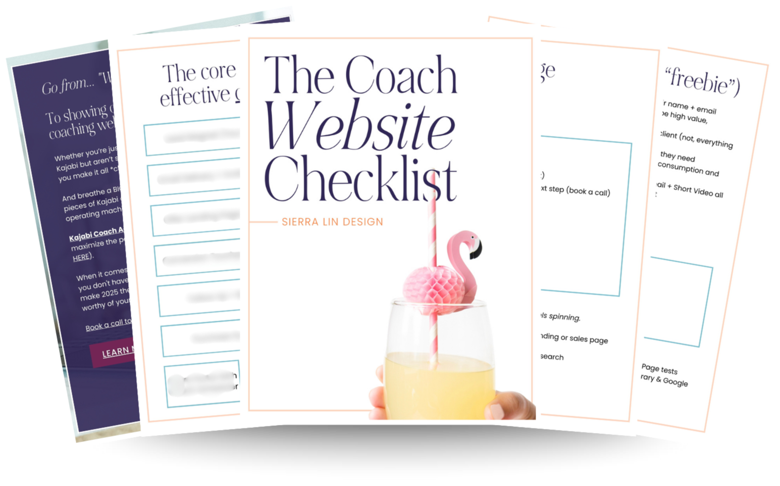
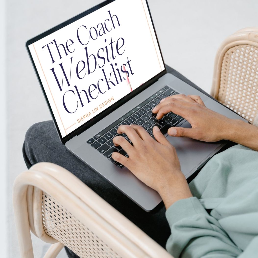
🚨Get the FREE Checklist
Skip the Kajabi tears—Swipe the free Coach Website Checklist & Funnel Map
Exactly what should go where on your Kajabi site to maximize coaching leads.